Set theme options
Theme options are settings that a theme offers, such as an accent color, a portal banner image or whether to show the navigation sidebar. Which options there are depends on the theme. You set their values per layout. To set theme options:
Select Layout in the top menu.
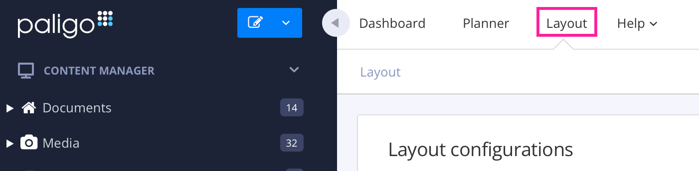
Paligo displays a list of Layouts. The list is empty if there are no custom Layouts in your Paligo instance.
Select the Layout you want to update or Create a Layout.
Tip
You can copy the URL of the Layout Editor and paste it into a new tab in your browser. This can be useful if you frequently switch between your Paligo content and the Layout settings.
Select Theme in the list of categories.
The theme's options are listed below the theme source. Some options have a short description under them, written by the theme's author.
Set the options you want to change. How you set an option depends on its type:
Color: choose a color in the color picker. If an option can be left empty, it shows No color set until you choose one.
Text and number: enter a value in the field.
Choice: choose one of the values in the list.
On or off: choose Enable or Disable.
Image: select Upload image and choose an image file. You can use JPG, PNG, GIF, WebP, SVG and ICO files of up to 5 MB.
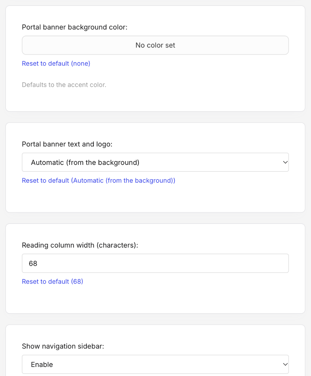
To return an option to the theme's own value, select Reset to default under it. The link shows what the default is.
Select Save.
The new values are used the next time you publish with the layout.
Note
An option you leave at its default value follows the theme. If you upload a new version of the theme that has a different default, the layout uses the new default. Values you have changed are kept when you upload a new version, as long as the new version still has that option.
Paligo Base theme options
Option | What it does |
|---|---|
Accent color | The color of links, buttons, the focus outline and the current item in the navigation. It is also the color of the portal banner, unless you set Portal banner background color. The same color is used in light and dark mode. |
Portal banner heading | The heading in the banner on the portal page. Leave it empty to use the publication's own heading, which is translated with the publication. |
Portal banner sub-line | A line of text under the banner heading. Leave it empty for no sub-line. |
Portal banner background image | An image to show in the banner, in place of the color. The image covers the whole banner. |
Portal banner background color | The color of the portal banner. Leave it empty to use the accent color. |
Portal banner text and logo | Whether the banner's text, search box and logo are light or dark. Automatic (from the background) chooses whichever is easier to read on the banner color, and chooses light over an image. |
Reading column width (characters) | The greatest width of the text column, in characters. The default is 68. On narrow screens, the text uses the whole width. |
Show navigation sidebar | Shows or hides the navigation sidebar and its menu button. |
Show on-page table of contents | Shows or hides the list of the current page's headings beside the content. It is only shown on wide screens. |
Copy button on code blocks | Shows or hides the button that copies the contents of a code block. |
Show the site title next to the logo | Shows the site title beside the logo in the header. Only applies when the layout has a logo. |
Footer text | Your own text for the footer. It replaces everything else in the footer: the site title or logo, the featured topics and the copyright line. |
Show the site logo in the footer | Shows the logo in the footer in place of the site title. Only applies when the layout has a logo. |
List the portal's featured topics in the footer | Adds links to the portal's featured topics to the footer. |
The site title, logo, copyright line and top navigation links are set in the layout's Branding settings, not in the theme options.