Editor
The built-in XML editor provides professional technical writers with all the necessary tools to fully control the structured content. To find out how to use the various editor features, see About Authoring.
Tip
From the editor you reach the Math Editor, Profiling Tab and Source Code Editor.
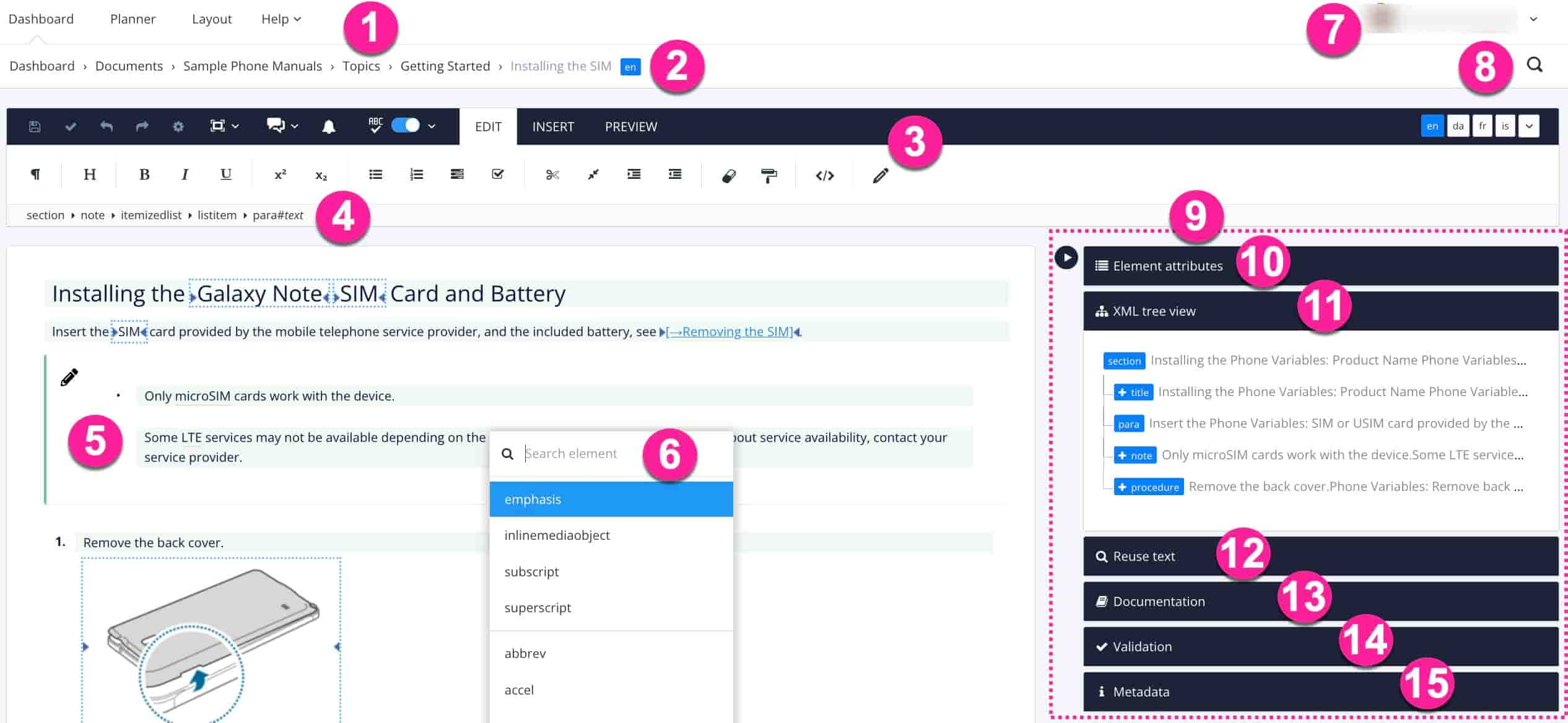 |
Areas surrounded by a blue dotted line shows that Variables are applied.
Top Menu to display Dashboard, Planner, Layout Editor or Help. From the help menu, you reach Paligo Support, Paligo Documentation, Paligo Academy and the possibility to Request a feature.
Show or Hide Side Panels also see Switch to Distraction-Free Mode.
Metadata Panel showing applied Taxonomies.
Tip
If you prefer, you can also use the Oxygen XML Editor.
A topic or component is by default opened in the Editor. There are two ways to display the Editor:
By clicking the name of the topic or component in the Content Manager.
Using the menu option Open in editor.
Tip
You can open multiple Paligo windows in the same web browser, but be careful when editing and saving, because there is potential to overwrite changes you have made.
Select the topic or component in the Content Manager to open it in the Editor.
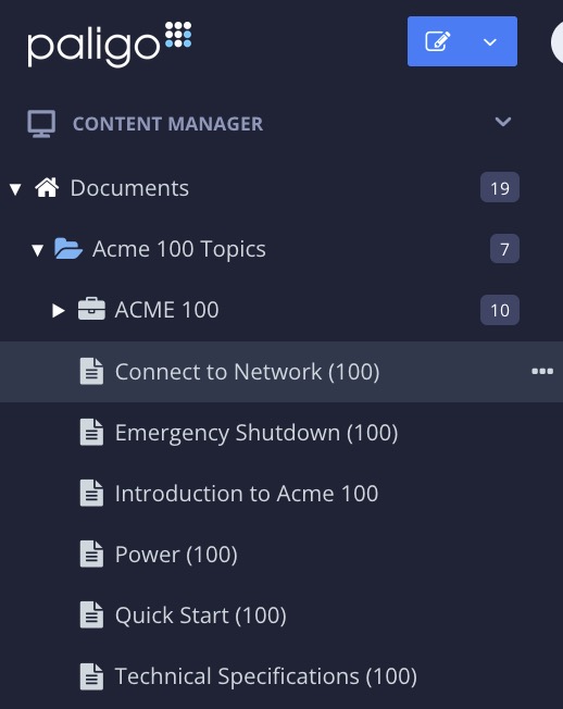
Alternatively, you can Create a Topic and edit that.
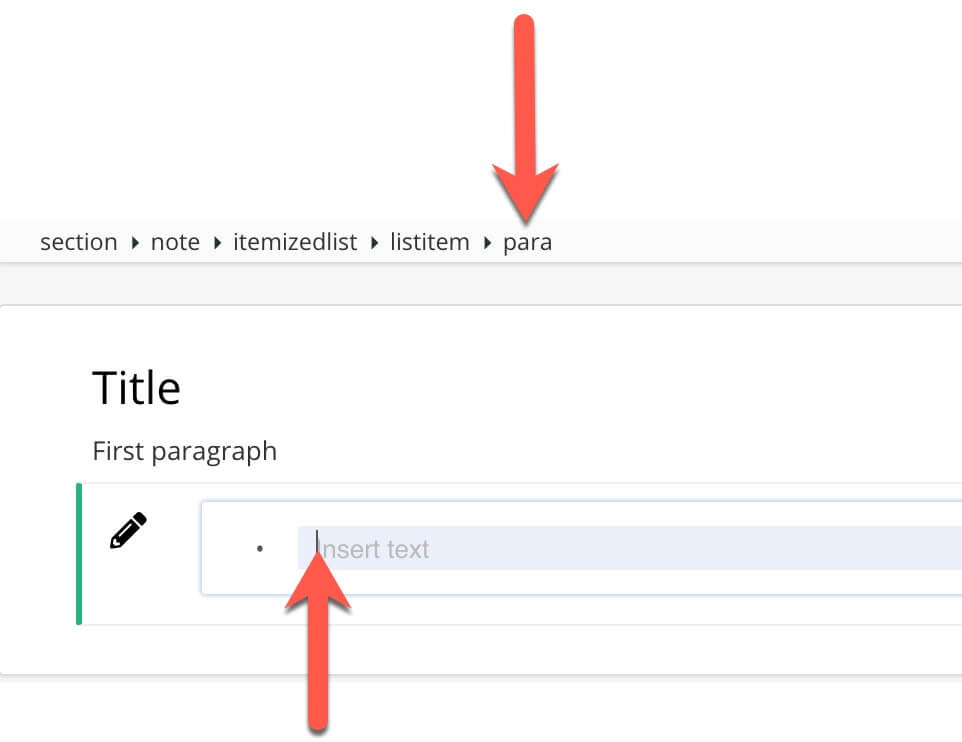
The cursor location is what determines what is the currently selected element. When you move the cursor and select another part of the topic, you will see that the Element Structure Menu changes to show you the structure.
The Element Structure Menu also provides a list of options for working with specific elements. If you select an element in the Element Structure Menu, the options that are available for that element are shown.
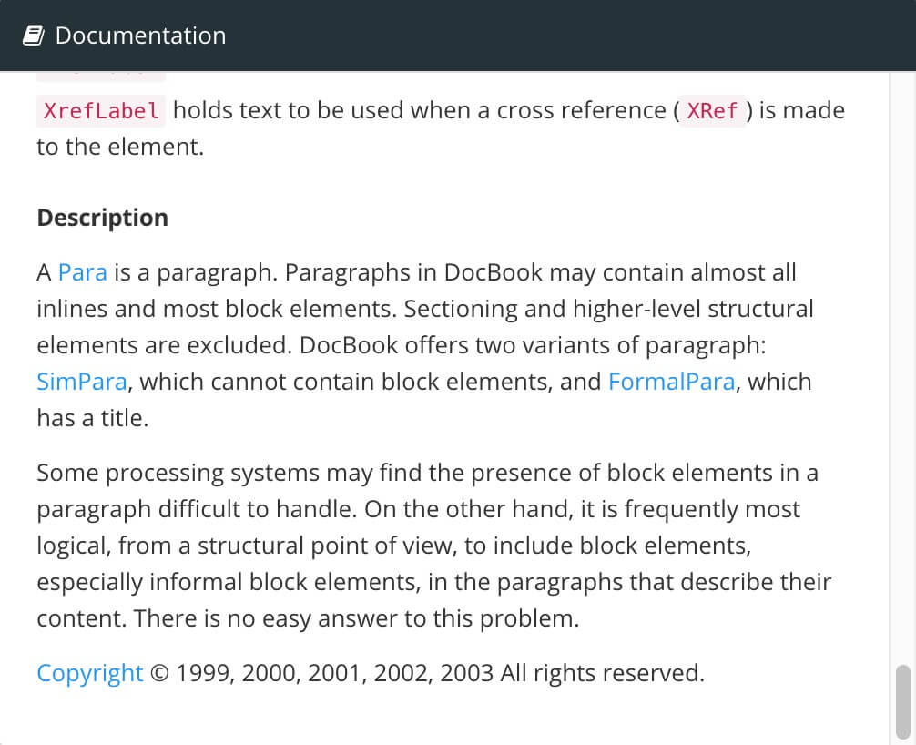
The Documentation panel provides information about the currently selected element. It shows a list of Common Attributes that are often used with that element, with a brief description of each attribute. There is also a Description of the selected element, which is shown at the bottom of the documentation section.
 |
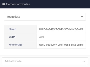
The Element Attributes Panel is one of the Editor features. It shows the attributes that are in place for the currently selected element. It is used to add, remove, edit and profile / filter an attribute and set its value.
Each element, such as a para, has its own properties, which are called attributes. When you add an attribute to an element and set its value, it only affects the specific element you selected. For example, if you add a filter element such as xinfo:country to a paragraph, it only applies to that paragraph and will not affect any other para elements.
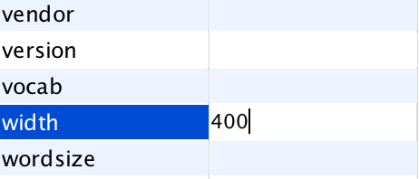
It is only possible to choose attributes that are valid for the type of element selected, for example, an imagedata element can have a width attribute. By adjusting the value of the width attribute, the size of the image is set. By using a percent sign (%) after the value, the image can be scaled. A width attribute cannot be set on a para element.
 |
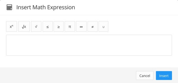
To add an equation or math phrase in your Paligo content, you use the element inlineequation, see Mathematics. Paligo supports two different math editors:
MathQuill is the default built-in math editor in Paligo. To learn how to use it, see Use the Built-In Math Editor.
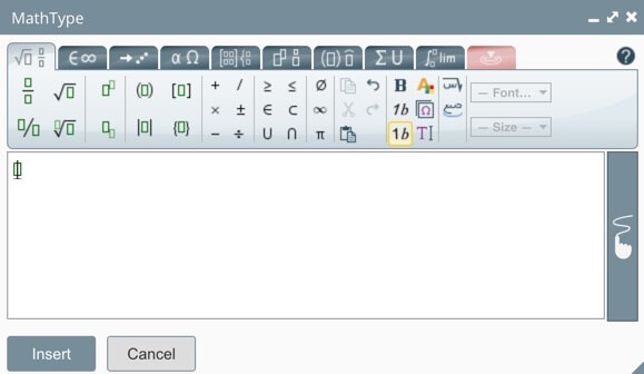
MathType provides more advanced mathematical features and requires a Wiris MathType subscription. This is available on the Enterprise plan . To learn how to access it, see Use the MathType Editor.
Paligo is made for easy authoring and the Paligo Editor is normally the first choice for most editing. However, the focus on user-friendliness in Paligo also means that the Paligo editor is intentionally kept as uncluttered and easy to use as possible, and targets the most common editing functionality. If you find yourself needing to perform something that you cannot find a way to do in the Paligo editor, you have the option of using the Oxygen XML Editor.
Publishing to web help if you want a different kind of HTML output than the default HTML or HTML5 Responsive Design, you have the option of publishing to web help in Oxygen. This is very similar to the traditional kind of "three-pane help" used in software. See Publish to Web Help from Oxygen XML Editor for more information.
Advanced XML editing if you need to manipulate the XML more directly than the Paligo editor is intended for.
Advanced imports of certain formats, read more in the Importing section.
Note
Note that you will need an Oxygen license (3rd party) if you want to use it. The plugin for integration to Paligo is however included in your Paligo license.
Paligo supports integration with both Oxygen XML Author and Oxygen XML Editor. The difference between these is that both work for topic editing, but Oxygen XML Editor also works for development of XSLT and more.
If you have no need to do advanced XSLT development, Oxygen XML Author is more than enough, and you should choose that if you just need to use it to edit topics in Paligo offline.
Since both are supported, we use the terms interchangeably below.
Download the Oxygen Author (the one with the red icon) from the Oxygen web site: Oxygen Author.
Note
If you are on Mac OS X, you should scroll down on the page and select the version that includes Java SE 8 or later, or click this link: Mac version for Java SE 8).
Install the Oxygen Author by following the installation wizard.
The first time you open Oxygen Author you will get the option to register it.
If you haven't purchased it yet, you can get a trial license from Oxygen.
Start Oxygen XML Editor.
Go to Help - Install new add-ons...
Paste the url https://resources.paligo.net/paligo-oxygen-addon.xml in the field Show add-ons from:
The Paligo plugin and the Configuration add-on will appear. Check the boxes next to these two installations.
Check the box to accept the License Agreement, and click Finish.
A panel called Content Manager should have appeared on the left. If it doesn't, go to Window - Show view - Content Manager.
Restart Oxygen.
When running the plugin for the first time, the Content Manager panel will ask you for hostname, username, and password. Do the following:
Type in companyname.paligoapp.com as the hostname (no https://), your username and your password. (Of course, replace the companyname part with your actual domain name, usually the same as your company name.
Click Test (Connection succeeded should appear).
Click Save to save the plugin configuration. Nothing appears to happen, but the configuration will be saved.
Restart Oxygen.
Note
When you restart, if the Content Manager view isn't open, open it by Window - Show View - Content Manager. It will show you a view similar to the Content Manager in the Paligo web interface.
Start the Oxygen client on your computer. Make sure you have already installed the Oxygen Paligo plugin.
If it's not already open, open the Content Manager view under Window > Show View > Content Manager.
Browse to the folder and the topic that you want to open, and double-click to open it.
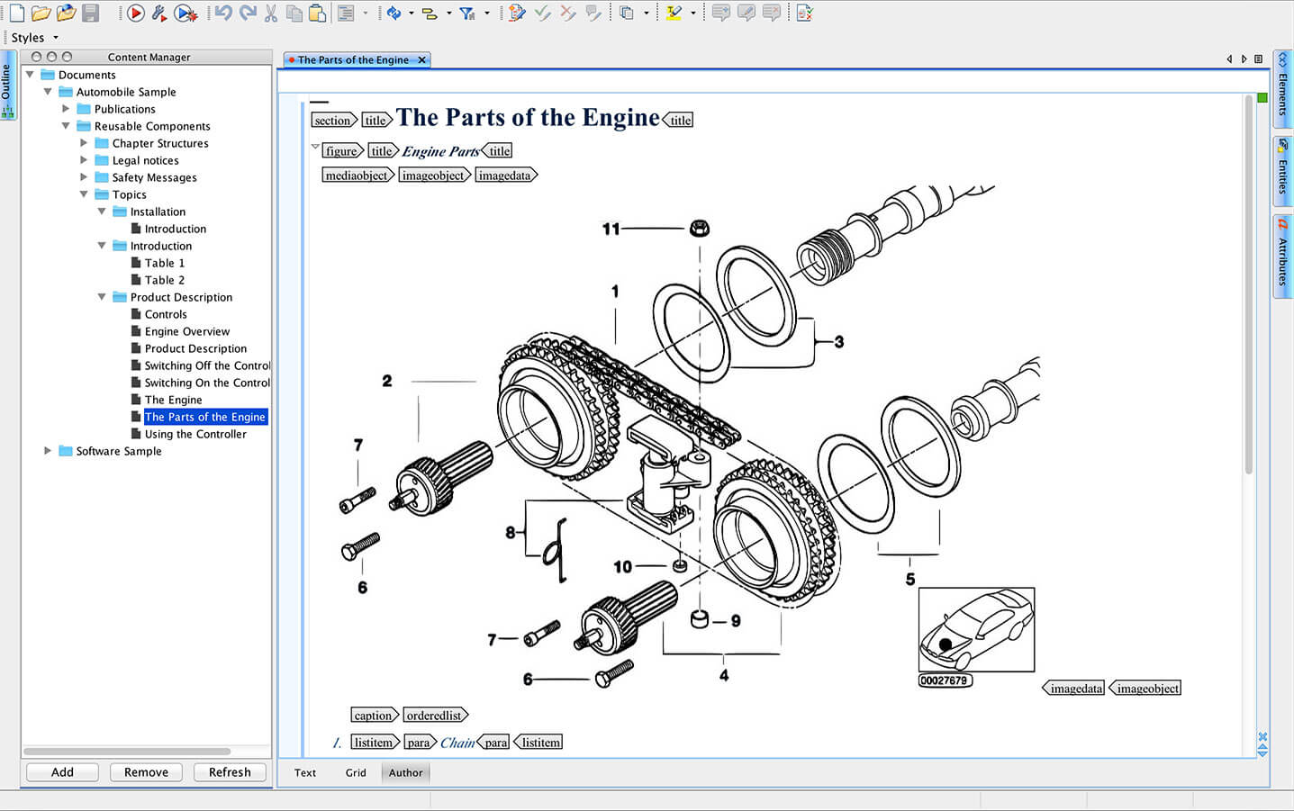
After you are done editing, save the topic and close it. If you need to check it in, go to Paligo to do so.
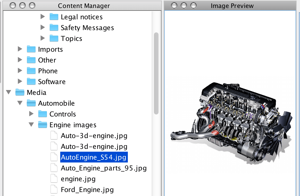
Besides opening and editing Paligo topics in Oxygen, you can also browse, preview, and insert images in topics, right from your Paligo image library.
To browse for images in the Paligo image library, simply use the file browser and preview any image by double-clicking it:
 |
To insert images, do as follows:
Open a Paligo topic in Oxygen, using the Paligo file browser.
Put the cursor in a valid position where you want the image.
Click the image icon in the toolbar:

In the image dialog, you will see that Paligo is available as a place to find images. Click to select the image.
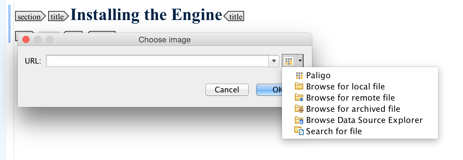
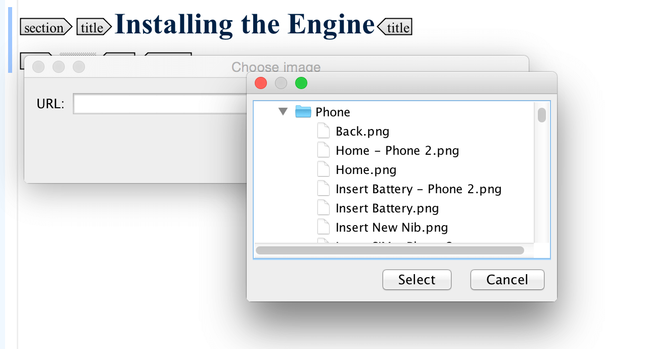
Note that you must select the image from the Paligo library. Local hard drive images will not work, and if you have local images you want to use, you need to upload them to Paligo first.
Select the image you want from the Paligo library.
The image will be inserted as a
figureelement. If you just want amediaobject, just select themediaobjectelement and drag it to where you want it outside of thefigureelement, and then delete thefigureelement.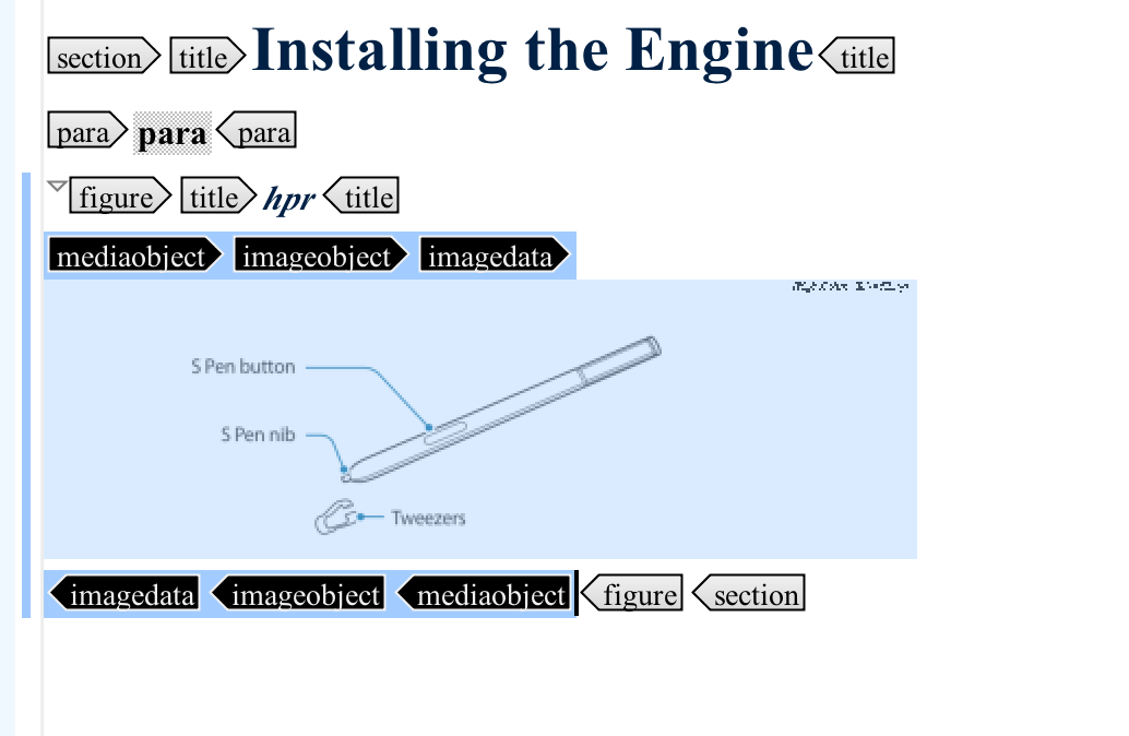
Set the width for the element using the Attributes view.
If you have content in Word, Excel or HTML, you can easily get it into a Paligo topic by opening the topic in Oxygen XML Author, using the Paligo plugin file browser.
This can be quite convenient, especially if you have long tables or Excel sheets that you want to turn into tables in a topic.
Note
Please note that this procedure presumes you have Oxygen XML Author client, and that you have the Paligo plugin installed for it.
Open a Paligo topic in Oxygen using the file browser.
Open the Word or Excel document, or open a web page in a browser.
Copy the content you want to insert in your topic.
Paste it anywhere it would be valid, e.g directly inside a section element. If it's not a valid position, Oxygen will alert you to this, and give you the option to insert it in a valid position.
Your content will automatically be converted to the correct XML structure, and you can save the topic to Paligo.
Note
To create a very modern type of web help in HTML5, you can publish directly to that just using the HTML5 format available directly in the publishing dialog. The below alternative is just an option in case you prefer more traditional 3-pane format in standard XHTML.
Using the Oxygen XML Editor, you can create standard XHTML web help output. The first time you do this, you may want to customize the output a bit. Although this can get a bit technical, this is something you normally only have to do once, and if you follow the instructions here it should not be a problem. If you do need help, please contact support and we'll walk you through it.
Start by publishing to XML.
Download the finished result, and go to the folder. Open the Publication XML file (It will have
publicationin its name) in Oxygen XML Editor. You need to have this file open before you can do the next step.Create a Transformation Scenario:
Either use the toolbar:

Or the menu:
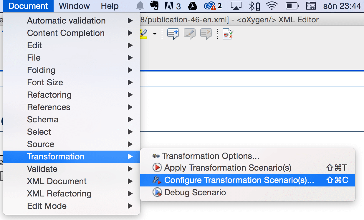
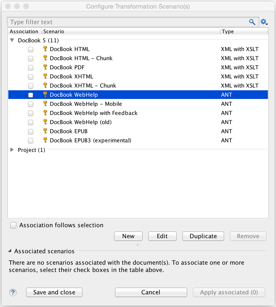
The Transformation Scenario dialog opens. We will use the DocBook webhelp scenario (since Paligo exports to DocBook format). Create a duplicate by clicking Duplicate.
A new dialog is opened for your new scenario. Give it any suitable name you wish ("WebHelp - Paligo" e.g.
If you want to customize the styling of your web help, do the following:
Select the tab <emphasis xmlns="http://docbook.org/ns/docbook">Parameters</emphasis>. Then type "css" in the filter text field. That will narrow down the choice of parameters.
Select the one called html.stylesheet. Double-click the Value field.
Type the full path, or browse to the custom css file you want to use. There is an example css with some basic customization in the Getting Started area of the Paligo support site.
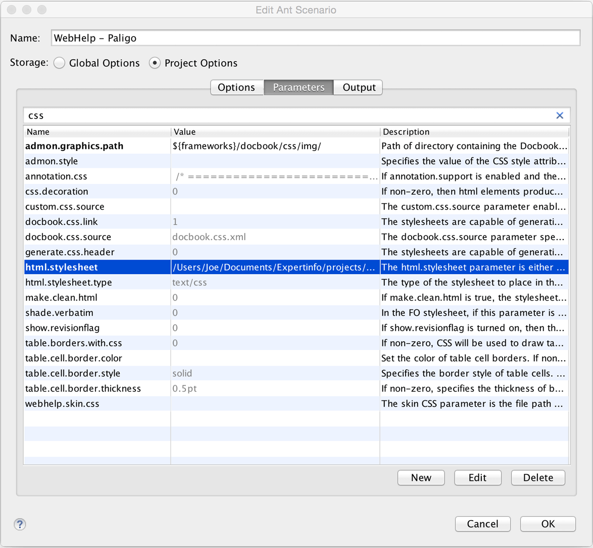
Click Ok, make sure your new scenario is checked, and then Save and close.
Run the publishing process (Transformation Scenario) by clicking the little "play" button in the toolbar, or select Document > Transformation > Apply Transformation Scenario(s)...

Next time you need to transform to web help, you just need to publish to XML from Paligo as in step 1, and then select your saved scenario and run the publishing directly.
When using variables and / or filters, you can configure settings to view specific variants of your content via the Profiling tab. You can reach the Profiling tab from Editor, Review View and Translation View. The filters you set in the Profiling tab will also apply when you preview content in PDF, HTML5 or HTML from within the editor. This is a very useful way to see how the profiled content will actually come out.
Tip
In the Options tab under Profile Settings, you can select whether to completely hide filtered content or to show it as a placeholder only (as in the image below). 
In Editor you set the profiling by clicking the Profile Settings under the Preview tab. 
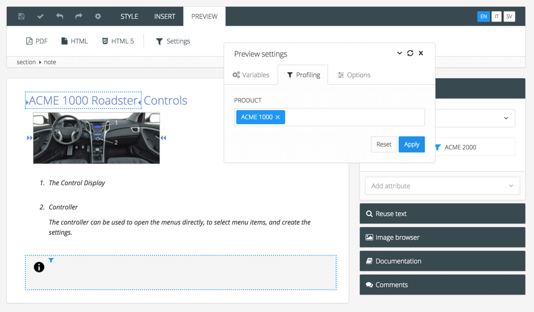 |
Example of variant view of a topic in the Editor with variable value filled in and profiled content filtered out.
In Review View and Translation View you set the profiling by clicking the cog icon at the top right corner. 
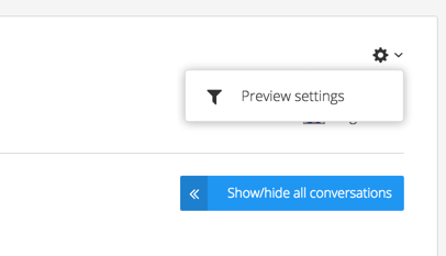
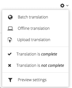
To the left - Profile settings in Review view. To the right - Profile settings in Translation view.
The Reuse Text panel is where you can search for existing text fragments in the database. If you are writing a paragraph or an instruction that you think may exist, you can search for it and reuse the existing version. Rather than repeatedly recreating recurring phrases, you write it once and reuse it wherever needed. Then, if the text ever needs to change, you can make the change once and it will apply to every instance automatically. To learn more, see Find Reusable Content and Reuse Text Fragments.
When a term is entered in the search field, a list of exact and close matches is presented in the Reuse Text panel. You can insert a match or access information about it via the cog icon. To the right of each match, the xml id is shown.
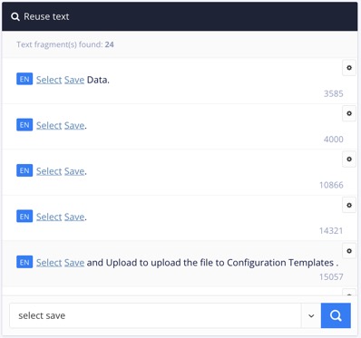 |
The xml id is shown to the right of each match.
Tip
If you want to reuse both text and image or perhaps a procedure, see Create an Informal Topic.
The Paligo Editor has a side panel that contains collapsible sections for Element Attributes Panel, XML Tree View, Reuse Text Panel, Documentation Panel, Validation Panel and Metadata Panel. By default, the side panels are shown next to the document editing area.
If you prefer, you can hide the side panels so that there is more space available for the document editing area. When hidden, only the icons for each section are shown.
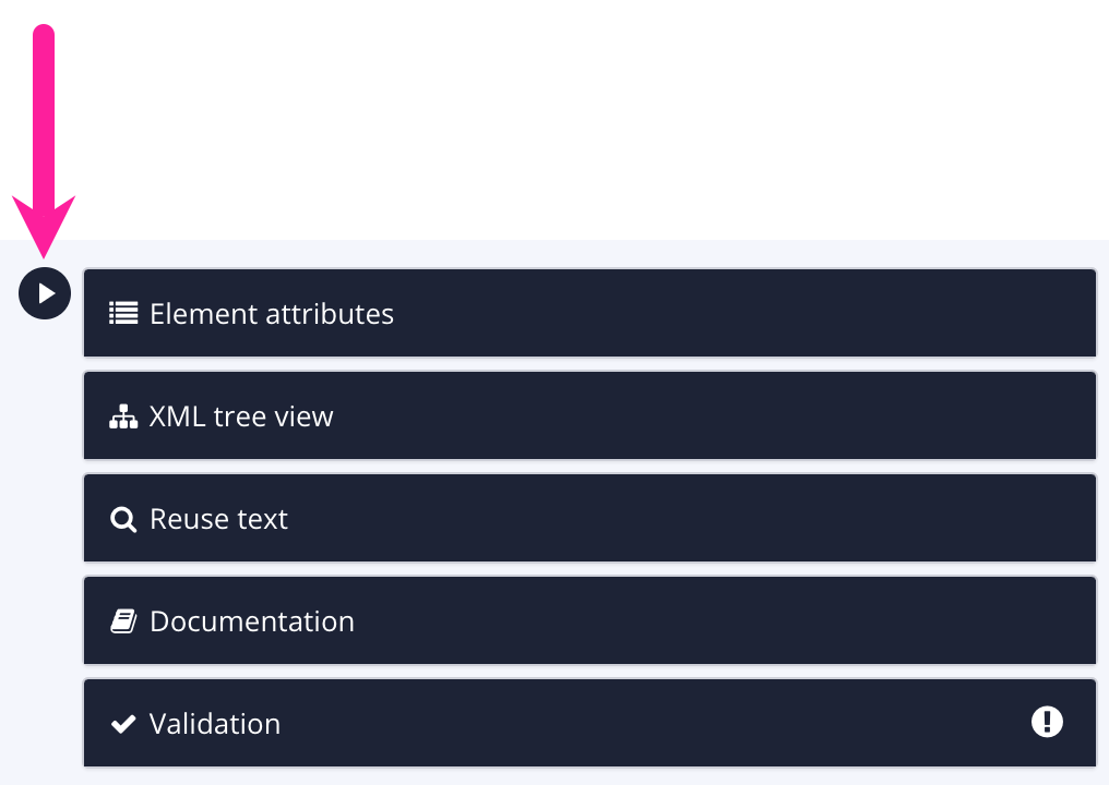 |
To show or hide the side panel, select the arrow icon next to the side panel. It works as a toggle, so select it again to switch between shown or hidden.
 |
Note
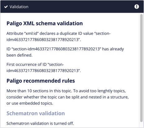
If you try to save a document that contains a validation error, Paligo expands the Validation Panel automatically. You can then use the error information to find out what the problem is.
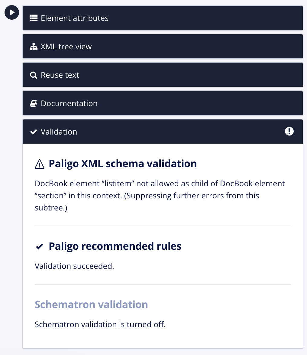 |
This applies irrespective of whether you have the side panel hidden or shown.
While the Paligo Editor is made to make structured authoring as natural as possible, there may be times when you need to edit the actual source XML. You can also Search and Replace with Source Code Editor.
 |
Warning
Please note that while convenient editing XML directly in plain code view, it requires that you are sure of what you are doing. As long as you have the auto-validation turned on, Paligo will prevent you from saving invalid XML. However you still have to be careful not make unintentional changes.
If you are not absolutely sure of what the result will be, you should be especially careful not to edit attributes such as xinfo:text and xml:id, since these are Paligo id:s.
To edit the XML in Paligo, you have to open the Source Code Editor.
Tip
This can also be done during an assignment in the Contributor Editor, see Edit the Source Code.
Select the topic or component in the Content Manager to open it in the Editor.

Alternatively, you can Create a Topic and edit that.
Select the Edit tab in the toolbar.

Select Edit source code.

Edit the source XML.
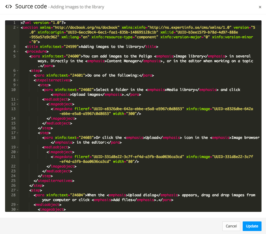
Select Update to save the changes or Cancel to ignore the changes.
Important
Note that this does not save the topic, it just updates the content just as if you had made any regular edit directly in the main editor view.
You can still undo any changes back in the main editor. The changes to the source code will be saved when you save the topic.
Close the Source Code Editor with the X in the top right corner.
Select Save.

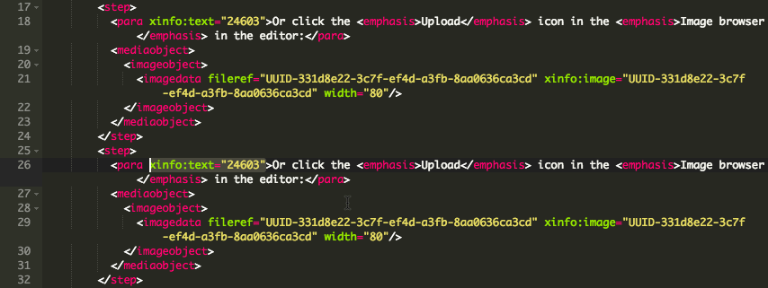
If you copy an element in the code editor and paste it in another place, you will by default get the text content as "Reuse text". The same as if you had used the Reuse text search feature or used the Copy as reuse keyboard shortcut.
If you do not want the text reused, this is one time where it can be useful to touch the xinfo:text attribute. To not have the text reused, simply remove the xinfo:text attributes:
 |
Warning
If you do this, it only changes it on the copied element, not the original. Otherwise you will create a completely new text fragment for the original text as well. If you for example have translated it before, that translation will be lost.
By default, the Source Code Editor uses the Monokai theme, a dark theme easy on the eyes. It has a black background with cerise, green, yellow and white color-coding for the XML elements, attributes, values and text.
You can set the source code editor to use a different theme. For example, the Chrome theme has a white background with red, blue, cerise and black color-coding.
But you can use any of a number of themes for the look and feel of the Source Code Editor, whatever is more comfortable for you. Just click the cog wheel icon in the toolbar, and select Code Editor.
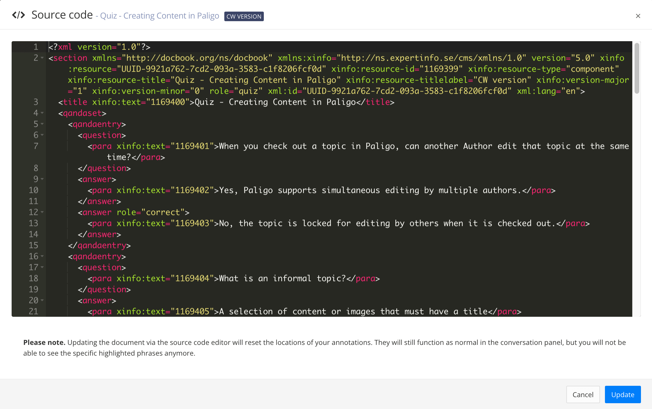
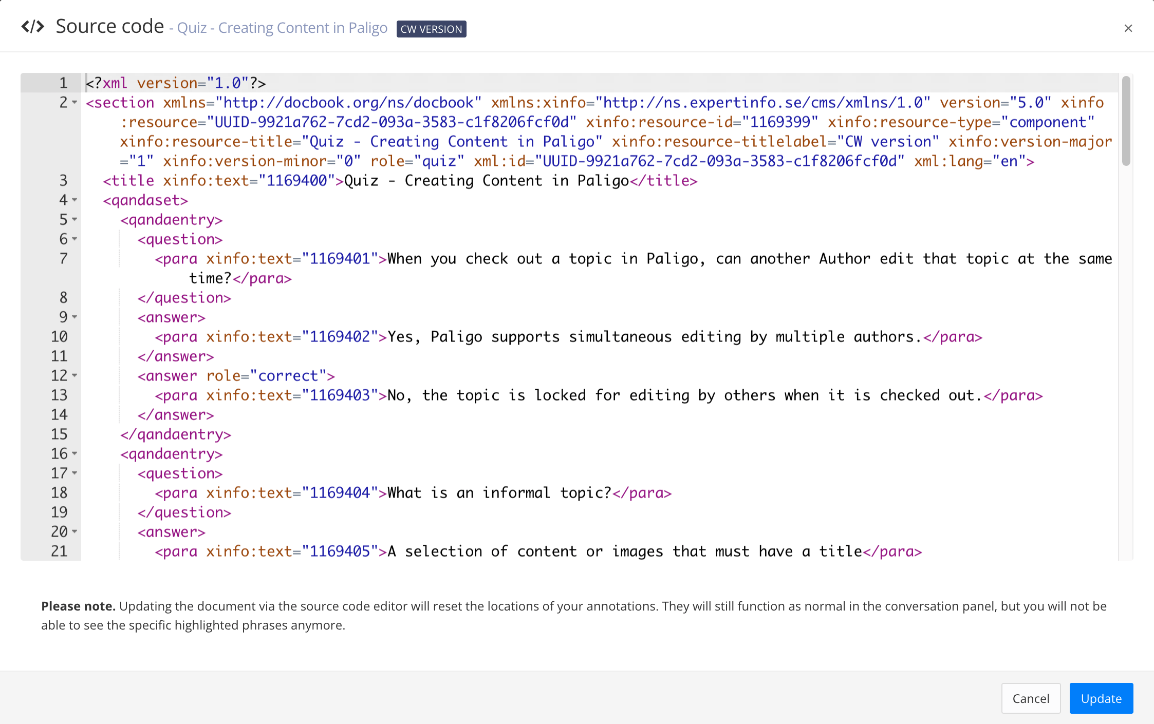
To the left, the Monokai theme. To the right, the Chrome theme.
To change the theme for the source code editor:
Select the Dotted menu ( ... ) for a topic in the Content Manager.
Select Edit and choose Open in editor.
Select Settings in the Toolbar.


Select the Code editor tab.
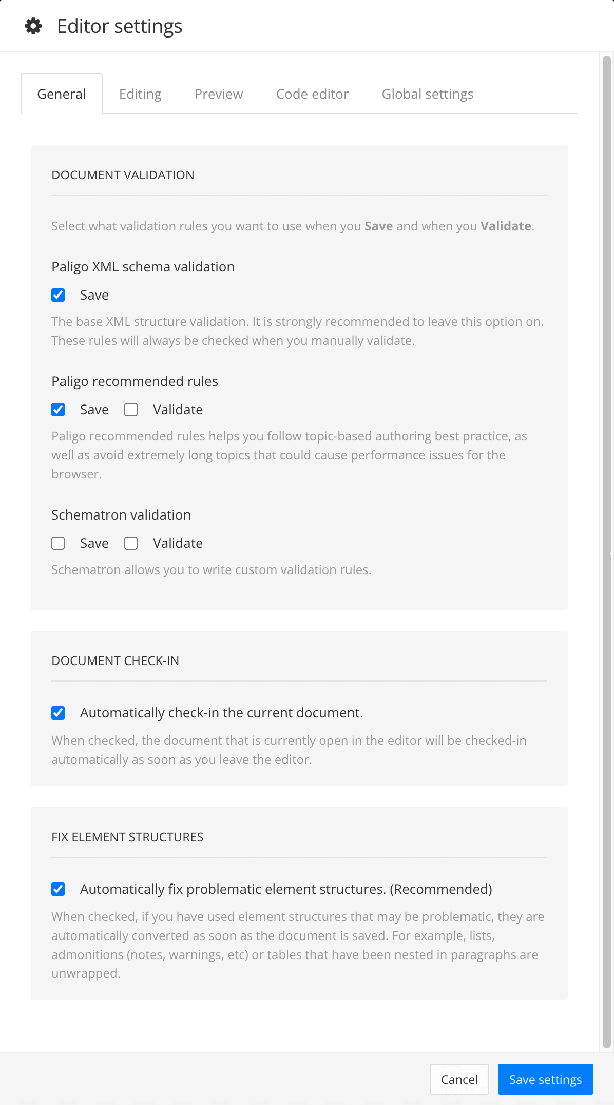
Select a theme from the dropdown menu in the Theme for the code editor section.
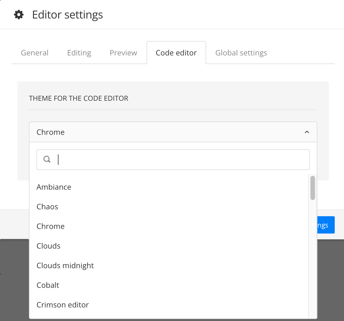
Select Save Settings.
The next time you open the source editor in the main editor, it will use the theme you have chosen.
The Toolbar has been divided into three tabs to make it easier to overview. The Edit and Insert tab contain most of the elements and actions you need for creating and reusing content. The Preview tab shows how your content will look when it is published. You can choose to preview the output as PDF, HTML or HTML5.
To find out how to use the various editor features, see About Authoring.
 |
Tip
Find useful keyboard shortcuts, see Keyboard Shortcuts
Paligo has many keyboard shortcuts, to make working with structured content as fast and efficient as possible. The action of a key combination depends on the context, as described below.
You can check what the current element is in the Element Structure Menu at the top of the Editor. The last element in the hierarchical path is the current element.
Almost all of the Toolbar commands can be activated with shortcuts.
 |
Tip
Check out these topics for more keyboard shortcuts:
Note
It's possible to have browser plug-ins that clash with the keyboard shortcuts that Paligo uses.
If a keyboard shortcut does not work, try to remove or disable the browser plug-ins. Alternatively, try to use a different browser without plugins.
Toolbar icon | Action | Mac | Windows | Description |
|---|---|---|---|---|
Edit tab | ||||
Insert a new | Option ⌥ + P | Alt + P | Where | |
N/A | New | Enter ⏎ | Enter ⏎ | At the end of a paragraph, a procedure step, or a list item, creates a new element of the same kind. For example if the cursor is at the end of a paragraph element, Enter creates a new paragraph, but in a list item or step it creates new list items or steps. You can also split the text in a paragraph or list by placing the cursor in the middle of the text. At the end of |
Toggle title on figures, tables, examples. | Option ⌥ + Shift ⇧ + H | Alt + Shift ⇧ + H | On Note that this also automatically converts the element to the proper one. For example a | |
Toggle bold text. | Command ⌘ + B | Ctrl + B | With text selected. | |
Toggle italic text. | Command ⌘ + I | Ctrl + I | With text selected. | |
Toggle underlined text.id | Command ⌘ + U | Ctrl + U | With text selected. | |
Superscript | N/A | N/A | Raise the selected text. | |
Subscript | N/A | N/A | Lower the selected text. | |
Create (or convert to) an Unordered list also called | Option ⌥ + L | Alt + L | Depending on the context:
| |
Create (or convert to) an Ordered list. | Option ⌥ + Shift ⇧ + L | Alt + Shift ⇧ + L | Depending on the context:
| |
Create (or convert to) a | Option ⌥ + Shift ⇧ + P | Alt + Shift ⇧ + P | Depending on the context:
| |
Split list | N/A | N/A | Splits a list in two lists of the same kind. | |
Merge list | N/A | N/A | Merges one list into the next one. | |
Indent the | Option ⌥ + T | Alt + T | In a | |
Outdent the nested list (of any of the named types) | Option ⌥ + Shift ⇧ + T | Alt + Shift ⇧ + T | In a nested | |
Remove formatting/inline tags. | Option ⌥ + Shift ⇧ + F | Alt + Shift ⇧ + F | Inside an inline element. Will remove common inline formatting tags like bold and italic, but also any other inline tag available. | |
Copy "formatting" (inline element but without content) | Option ⌥ + Control ^ + C | Alt + Ctrl + C | This is a function similar to a "format painter" in word processors, but copies the inline element without its text content, so that it can be pasted onto another text string. | |
N/A | Paste "formatting" (inline element but without content) | Option ⌥ + Control ^ + V | Alt + Ctrl + V | Paste (or "paint") the format/inline element copied with the command above. |
Edit Source Code | N/A | N/A | Open the Source Code Editor to edit the XML directly. | |
Insert tab | ||||
Insert a table. | Option ⌥ + Shift ⇧ + A | Alt + Shift ⇧ + A | Where a The toolbar icon opens a menu with table editing choices as well. | |
Reuse a component. | Option ⌥ + Shift ⇧ + R | Alt + Shift ⇧ + R | Where the type of component is valid (e.g a section, warning, etc). You can reuse other topics, informal topics, admonitions and more inside a topic. | |
Insert a cross-reference or other link. | Option ⌥ + R | Alt + R | Current text element where cross-reference is allowed. The keyboard shortcut opens the cross-reference dialog. The toolbar menu also has options for links to external web sites and email links. | |
Insert a variable. | Option ⌥ + Shift ⇧ + I | Alt + Shift ⇧ + I | Where the type of variable is valid. | |
Insert an image. | Option ⌥ + Control ^ + I | Alt + I or Alt + Ctrl + I | Where If the cursor is inside a text element, such as a | |
Insert a side-by-side image | Option ⌥ + J | Alt + J | For inserting images side by side. The feature is responsive for HTML5, so if on a smaller screen the images will stack vertically to fit. | |
Convert image to thumbnail | Option ⌥ + Shift ⇧ + Q | Alt + Shift ⇧ + Q | With | |
Insert a video | N/A | N/A | Where a video is valid. | |
Insert character | N/A | N/A | Inserts a special character from a character map inside text elements. | |
Insert (or convert to) a | Option ⌥ + Shift ⇧ + N | Alt + Shift ⇧ + N | Where a Converts the admonition if another admonition type element is selected. | |
Insert (or convert to) a | Option ⌥ + Shift ⇧ + W | Alt + Shift ⇧ + W | Where a Converts the admonition if another admonition type element is selected. | |
Insert (or convert to) a | Option ⌥ + Shift ⇧ + C | Alt + Shift ⇧ + C | Where a Converts the admonition if another admonition type element is selected. | |
Insert (or convert to) a | Option ⌥ + Control ⌃ + T | Ctrl + Alt + T | Where a Converts the admonition if another admonition type element is selected. | |
| N/A | N/A | Do not have keyboard shortcuts. Must be inserted with the toolbar options. | |
Preview tab | ||||
Preview PDF | N/A | N/A | Preview a PDF of the currently open topic. You can select to use your own layout when previewing content, in the Editor settings. | |
Preview plain HTML | N/A | N/A | Preview a plain (X)HTML version of the currently open topic. You can select to use your own layout when previewing content, in the Editor settings. | |
Preview HTML5 | N/A | N/A | Preview an HTML5 version of the currently open topic. You can select to use your own layout when previewing content, in the Editor settings. | |
Profile settings | N/A | N/A | Set profile filter and variable settings to view the effect of these directly in the editor. These settings will also be used when previewing in different output formats. | |
Other commands | ||||
N/A | Toggle | Option ⌥ + G | Alt + G | Element |
N/A | Toggle | Option ⌥ + K | Alt + K | Element |
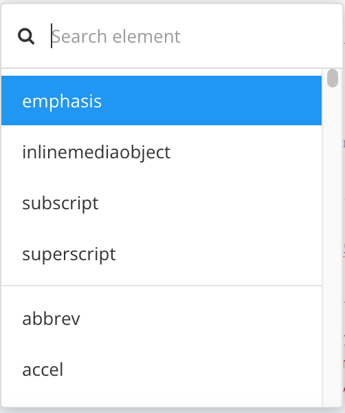
N/A | Show the Element list. to insert elements. | Command ⌘ + Enter or Option ⌥ + Enter | Alt + Enter | Valid anywhere in the topic. This is the main command for viewing all available elements at a certain position in your document. |
N/A | Move from one cell to the next in a table. | Tab | Tab | In tables. |
N/A | Navigate between elements. | ↓, ↑, →, ← | ↓, ↑, →, ← | Anywhere. |
Save the topic. | Command ⌘ + S | Ctrl + S | Anywhere. | |
Undo the last action. | Command ⌘ + Z | Ctrl + Z | Anywhere. | |
Redo the last action. | Command ⌘ + Y | Ctrl + Y | Anywhere. | |
N/A | Copy text | Command ⌘ + C | Ctrl + C | Copies the highlighted text, not the entire element. |
Copy element | Option ⌥ + C | Alt + C | Copies the current element the cursor is in. | |
N/A | Cut text | Command ⌘ + X | Ctrl + X | Removes the highlighted text, not the entire element, and copies it to the clipboard. |
Cut element | Option ⌥ X | Alt + X | Cuts the current element the cursor is in. | |
Delete element | Option ⌥ + Shift ⇧ + D | Alt + Shift + D | Paligo removes the element and the content inside the element, including any "child" elements. | |
N/A | Paste text | Command ⌘ + V | Ctrl + V | Pastes a copied or cut text in the current element the cursor is in. |
Paste element | Option ⌥ + V | Alt + V | Pastes a copied or cut element in the current element the cursor is in with new ID. | |
Paste element as reuse | Option ⌥ + Shift ⇧ + V | Alt + Shift + V | Pastes a copied or cut element in the current element the cursor is in, reusing any text fragment(s) in the element. Any changes you make to the "copy" will also affect the original as they have the same ID. | |
The Table context menu (right-click in table) | Insert column right | Option ⌥ + Control ^ + → | Alt + Ctrl + → | Inserts a new column to the right of the column where the cursor is. See also Display Table Settings. |
The Table context menu (right-click in table) | Insert row after | Option ⌥ + Control ^ + ↓ | Alt + Ctrl + ↓ | Inserts a new row after the row where the cursor is. See also Display Table Settings. |
The Table context menu (right-click in table) | Merge the selected cells in a table. | Option ⌥ + M | Alt + M | In a table, with multiple table cells selected using the Shift key. See also Display Table Settings. |
The Table context menu (right-click in table) | Split the cell into two cells. | Option ⌥ + Shift ⇧ + M | Alt + Shift + M | In a table, with cursor in previously merged table cell. See also Display Table Settings. |
N/A | Deletes the element where the cursor is | Option ⌥ + Shift ⇧ + D | Alt + Shift + D | With any element. This is a very convenient shortcut to quickly delete an element, but use with caution, and make sure to check the Structure menu to see that the current element is the one you want to delete. |
Element Structure Menu or the Table context menu (for moving table rows) | Move current element down | Option ⌥ + Shift ⇧ + ↓ | Alt + Shift ⇧ + ↓ | Current element. When moving a table row with the Table context menu, the cursor can be anywhere inside the table cell, within a para, for example. But when using the keyboard shortcut, the cursor should be directly inside the table cell element ( |
Element Structure Menu or the Table context menu (for moving table rows) | Move current element up | Option ⌥ + Shift ⇧ + ↑ | Alt + Shift ⇧ + ↑ | Current element When moving a table row with the Table context menu, the cursor can be anywhere inside the table cell, within a para, for example. But when using the keyboard shortcut, the cursor should be directly inside the table cell element ( |
N/A | Insert a | Option ⌥ + . | Alt + . | If your cursor location is where a block element is valid, a |
N/A | Insert a | Option ⌥ + E | Alt + E | In a text element, such as a |
N/A | Convert nested section to accordion | Option ⌥ + Shift ⇧ + Y | Alt + Shift ⇧ + Y | With a nested |
N/A | Convert bridgehead to a section, nesting the content after the bridgehead in the new section. | Control ^ + Option ⌥ + Shift ⇧ + W | Ctrl + Alt + Shift ⇧ + W | With a Internal So when converting, consider this, and for example if you have several |
N/A | Insert dynamic text variable. | Control ^ + Option ⌥ + Shift ⇧ + I | Ctrl + Alt + Shift + I | In a text element, such as a |
N/A | Sort glossary terms into alphabetical order. | Control ^ + Option ⌥ + Shift ⇧ + G | Ctrl + Alt + Shift + G | Place the cursor inside the |
Your content is automatically validated by Paligo before it is saved to the database. You can turn this feature on and off, see Turn Validation On or Off. It is also possible to validate the content manually, see Validate Content Manually.
If your content have broken any of the Validation Rules, Paligo displays an error message and adds a red highlight to the element. The Validation Panel provides information about the error to help you solve it, see Invalid Content.
 |
The XML tree view shows the structure of the topic that you have open in the main Paligo editor. For writers, it is especially useful as it means you can see the elements you have in place all at once, and it also makes it much easier to move blocks of content to new positions. You can drag an element from one position in the XML tree to another and your topic will update automatically to match.
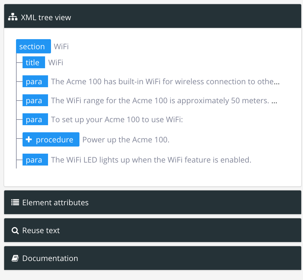 |
To find out more about the XML Structure view, see Move Elements.
