Content Manager
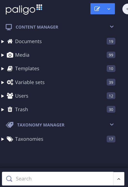
Use the Content Manager to create and organize your content. It feels similar to a regular file browser, but with very big differences. The content is stored in a database and among other things Paligo keeps track of all the relationships between the resources, where they are used and reused, what topics have links to others and so on. This means that you don't have to worry about moving things around in different folders, as links will not be broken.
From the Content Manager you reach the Resource View, Structure View, Taxonomy Manager, Translation View and Editor.
 |
Important
To see the latest changes in the Content Manager, you may need to refresh the page in your browser. This is especially true if you have Paligo open in multiple tabs.
Note
Images are stored in the Media folder. 
When an image is added to a topic, you only see a reference to it rather than the actual image.
Tip
Selecting multiple components at the same time in the Content Manager works just like in most file browsers. Collect them by holding down:
Shift to select the first and last topics in a range of topics.
Cmd ⌘ (Mac) / Ctrl (Windows) key to select or deselect individual items.
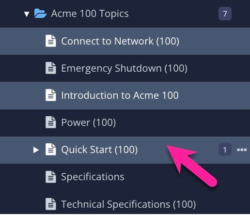 |
Click outside the actual name to avoid opening them in the Editor.
Then use the dotted menu (...) to the right of a component to select an option.
The Content Manager holds a variety of content, all designated by different icons. Different items should sometimes be stored in different areas too, explained below.
Type of content | Icon | Description | |
|---|---|---|---|
Content Library |
| The Content Library holds all textual content - i.e topics, safety message components, etc, as well as the Publications. | |
Folder |
| The Folder object works just like a folder in any file browser - i.e you use it to organize your content. You can create as many folders as you want and nest them, just like you are used to. The difference compared to a regular file browser is that Paligo keeps track of everything, so it doesn't matter if you move content. Paligo will know if there are links or other relationships, and keep them intact no matter how you move content around. | |
Publication |
| The Publication type (doesn't have to be an entire publication, but also a chapter or similar smaller structure) is like a container where you insert and reuse your topics. Normally you don´t open a Publication in the Editor, only in the Structure View to build your publications reusing your topics there. | |
Topic |
| A Topic is the basic building block you author, such as an instruction, a warning, or a description. | |
Informal Topic | An Informal Topic is a reusable building block that consists of smaller elements, such as a step that is reused in multiple procedures, or a paragraph with an image. It is not a complete topic. | ||
Media Library |
| The Media Library is where you store your images. You can create folders here too, to keep things organized. | |
Image |
| Images, stored in the Media Library, can be of most types. You only need to store one version of each image. For instance, you can store e.g a Photoshop (.psd) or Illustrator (.ai) image, with layers and everything, and Paligo will take care of converting it into the appropriate output formats, such as low res .png for web and high res .tif for print | |
Templates |
| You can create templates, i.e topics with predefined structure, and store them in the Templates Library. You can then use these templates to create new topics. | |
Variable Set Library |
| This icon designates the Variable Set Library, holding any number of Variable Sets. | |
Variable Set |
| A Variable Set holds variables, that can be used in topics. | |
Taxonomy Browser |
| This is really another type of content browser, where you organize your content by tagging it by category. You can create any number of taxonomies here. | |
Taxonomies |
| The root taxonomy tag holds all your various taxonomies. You can have one for product families for instance, one for subject matter, etc. |
The publications and topics shown in the Content Manager can have color-coded symbols that indicate status. The status can relate to the production workflow, being checked-in or out, and also branches.
Icon | Color | Description |
|---|---|---|
 | Purple dot | The content is in the In review stage of the production workflow. |
 | Blue dot | The content is in the In translation or In translation review stage of the production workflow. |
 | Green dot | The content is in the Released stage of the production workflow. |
 | Solid green checkmark | You have the content checked out. To find out about checking content in and out, see Check-in and Check-out. |
 | Faded green checkmark | Another user has the content checked out. If you hover the cursor over it, Paligo shows details of who has the content checked out. To find out about checking content in and out, see Check-in and Check-out. |
 | White branch icon | The content is the original version, but has branched versions too. To find out about branches, see Branching. |
 | Blue branch icon | The content is a branch of another component. The number indicates whether it is the first branch, second branch, third branch, and so on. To find out about branches, see Branching. |
The default click behavior for topics and publications means that clicking on topics or publications in the Content Manager will cause different views to open:
Clicking Topics opens them in the Editor since you are most likely to want to edit a topic most of the time.
Clicking Publications opens them in the Structure View since it is generally a much more common task to build a publication structure rather than editing it in the Editor.
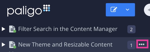
If you need to open a topic in the Structure View, or a publication in the Editor, you use commands in the dotted menu (...). It appears on the right side of a component when you hover over it in the Content Manager.
 |
Note
Many of the Keyboard Shortcuts apply to the "current" or "selected" element, that is the one the cursor is located in.
You can check what the current element is in the Element Structure Menu at the top of the Editor. The last element in the hierarchical path is the current element.
With the Follow feature, you can get Paligo to send you a notification whenever another user makes a change to a component, such as a topic, publication, or admonition. This is a great way to keep up-to-date with work that is taking place on particular pieces of content.
To use the Follow feature, you first need to set up your profile so that you receive notifications, see Choose Notification Types. When that is in place, you can Follow a Component and receive notifications when another user:
Edits the component in the Paligo editor
Updates the structure, for example, changes the order of topics in a publication structure.
Renames the component.
When you are no longer interested in the component, you can Unfollow a Component. Paligo will then stop sending you notifications about that component.
To choose the type of notifications you will receive when you follow a component, use the My Profile settings.
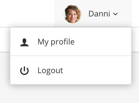
Select the avatar in the top right corner.

Select My Profile.

Select the Notifications tab.

Note
You have to "follow" notifications to receive information when changes are made by other users. There will be no notifications if you make changes yourself.
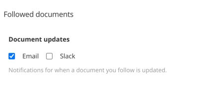
Scroll down to Followed documents section.
Check the box(es) for the notification types (email or Slack) you want to receive.
The Slack notifications will only work if you have set up the Slack Integration.
Select Save.
When you have set up your profile so that you will receive notifications when you follow a component, you can start following topics, publications, informal topics or admonitions. You can follow these without setting up your profile, but you will not receive any notifications.
Tip
If you want to stop receiving notifications, see Unfollow a Component.
To start following a component:
Select the Dotted menu ( ... ) to the right of the component in the Content Manager
Select Follow.
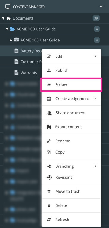
Paligo will send you a notification when another user makes changes to the followed component.
Use the Unfollow feature to stop following a topic, publication, informal topic or admonition. When you unfollow a component, you will stop receiving notifications when another user makes changes to it.
Tip
To receive notifications about content changes, see Follow a Component.
To stop following a component:
Select the Dotted menu ( ... ) to the right of the component in the Content Manager
Select Unfollow.

You will no longer receive change notifications.
By creating folders, you can organize your content any way you want. You can add folders inside other folders, if needed, to create a hierarchy of your main content components (publications, topics, informal topics, admonitions).
We recommend that you think carefully about your content organization from the start, and consider where new content will be added. You will need a structure that is logical and makes it easy for you and other authors to find and reuse topics.
It is a good idea to try and keep the number of components down in each folder. Keeping a few components in the same folder will give you better performance, and it will also be easier to get an overview.
Tip
Try to think of this in conjunction with taxonomies if you have that feature in your plan. Taxonomies allow you to organize your content in multiple ways.
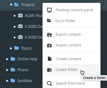
To create a folder, select the dotted menu (...) to the right of a folder in the Content Manager and select Create folder.
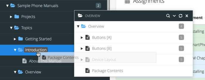
To move a component, just drag and drop it in the structure. Either in the same browser or Use Floating Content Panels. You will have to confirm the move before it's executed.
Tip
Selecting multiple components at the same time in the Content Manager works just like in most file browsers. Collect them by holding down:
Shift to select the first and last topics in a range of topics.
Cmd ⌘ (Mac) / Ctrl (Windows) key to select or deselect individual items.

Click outside the actual name to avoid opening them in the Editor.
Then use the dotted menu (...) to the right of a component to select an option.
You can rename your content in the Content Manager and via Advanced Search, see Search and Rename.
Locate the topic in the Content Manager.
Double-click outside the actual name in the Content Manager.
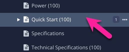
Click outside the actual name to avoid opening it in the Editor.
Update the name and press Enter (or the checkmark) to confirm the change.

To change the size of the Content Manager sidebar, use the arrow icon that appears on its edge.
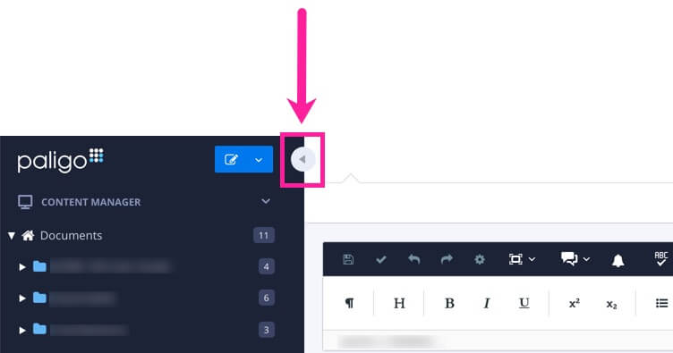
Drag the icon left and right to increase or decrease the width of the Content Manager sidebar.
Select the icon to toggle the Content Manager sidebar between minimal size and its previous size.
Press and hold Shift and then select the icon to return the Content Manager sidebar to its default size.
In the Resource View, you find useful information about the content in a folder, such as details of existing translations, assignments and snapshots. You can also use it to change the Workflow Status of your content (for example "In translation").
There are two views that you can switch between by using the buttons in the top-right corner.
 |
List View - Provides an overview of the resources and also provides access to the Resource Detail Panel.
Grid View - A summary without the Resource Detail Panel. It does not provide the same level of information or options.
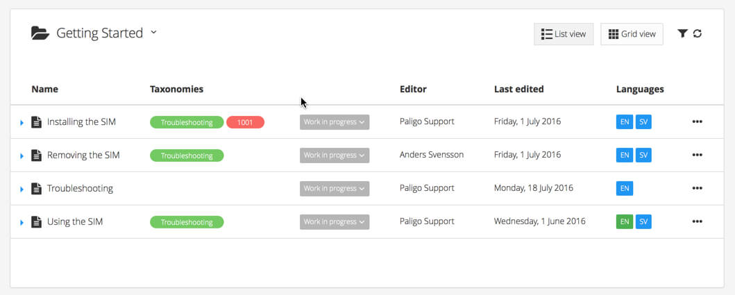 |
The Resource View shows List View as default.
Tip
Right-click the topic name and select Open link in new tab to avoid navigating away from the current view.
Select a folder in the Content Manager to open the Resource view for the selected folder.
Select the
foldercontaining the content in Content Manager.
If the content is not in a folder, select the top-level folder Documents.

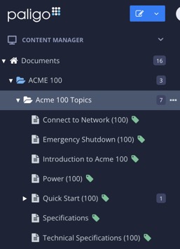
This will open the Resource View.
The selected folder is displayed in List View.

Each component or topic show:
Name - The name of the component or topic.
Taxonomies - Show if any taxonomy tags have been applied to it.
Status - The Workflow Status of the component or topic (for example Work in progress or In translation).
Last edit by - The name of the person who last edited the content.
Last Edited - The date and time that the content was most recently edited and saved.
Languages - Added languages for the content, shown as two letter codes (for example EN for English or FR for French).
Select the blue arrow to the left of the component or topic to see the Resource Detail Panel.

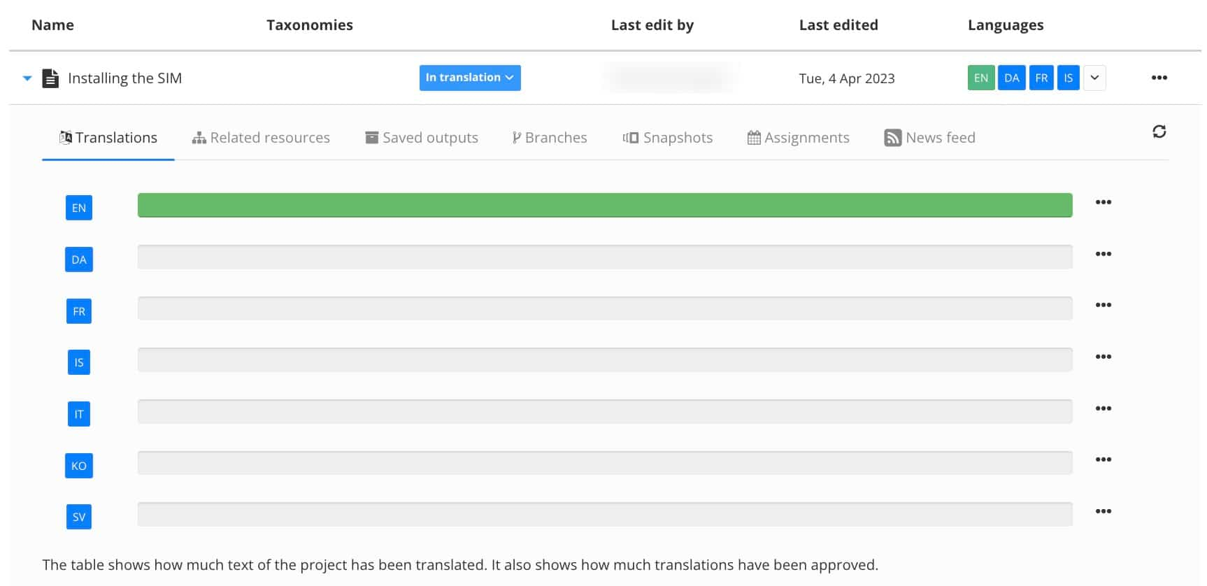
The following tabs show:
 Translations - Shows how much text of the content that has been translated to selected languages.
 Related resources - Information about:
Related publications where it is reused.
Reused content that is if the component includes other components and if the component itself is used elsewhere.
Reused in publications or other topics where the content is reused.
Languages added shows languages added, and also if a language is missing (in other words if a topic is missing a language that is set on a publication it is reused in).
Links to topics or components.
Linked to by other topics or component.
Related images, images included in the component.
 Saved outputs - During publish, if you use the checkbox Save output in Paligo, it will then be stored in the Saved Output section in the Resource Detail Panel.
Select the link or the Download file button to download the output file in your browser.

 Branches - Shows if there are any existing branches of the component.
 Snapshots - Released versions saved when the content goes through the Release Process.
 Assignments - If there are any assignments for this particular document, they will be shown here.
 News feed - Any activity concerning this document will be displayed here.
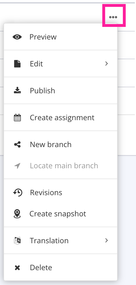
To the right of each component or topic there is a dotted menu (...) with options for the different actions.
Available options vary depending on your permissions, the type of component, its status and translations.
By default, each folder in the Content Manager has its contents listed by folder first, then publication, then topic, with each of those listed alphabetically. But you can change the order, if required.
In the Content Manager, select the options menu ( ...) for the folder that contains the components you want to sort. Then select Sort and choose an option from the menu:
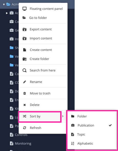
Folder - Sorts the selected folder so that folders are shown at the top, then publications, then topics.
Publication - Sorts the selected folder so that publications are shown at the top, then folders, then topics.
Topic - Sorts the selected folder so that topics are shown at the top, then folders, then publications.
Alphabetic - Sorts the selected folder in alphabetical order, and ignores the type of content.
Floating content panels work in a similar way to the Content Manager, but they are not tied to the left side of the user interface. You can move them to any position on your screen.
There are two main benefits of using floating content panels:
You can open multiple panels at the same time. This can make it easier to manage your content, for example, dragging and dropping between folders.
You can select any folder or top-level directory (Variable sets, Users. Taxonomies) as the "root" of a floating panel.
For example, you could create a floating panel for the Media Library or a specific folder in the Content Manager. This is a convenient way to focus on a particular area of your content without having to navigate the entire Content Manager.
To access one or more Floating Content Panels, select the options menu ( ... ) next to the folder or directory you want to browse.
Select Floating content panel.
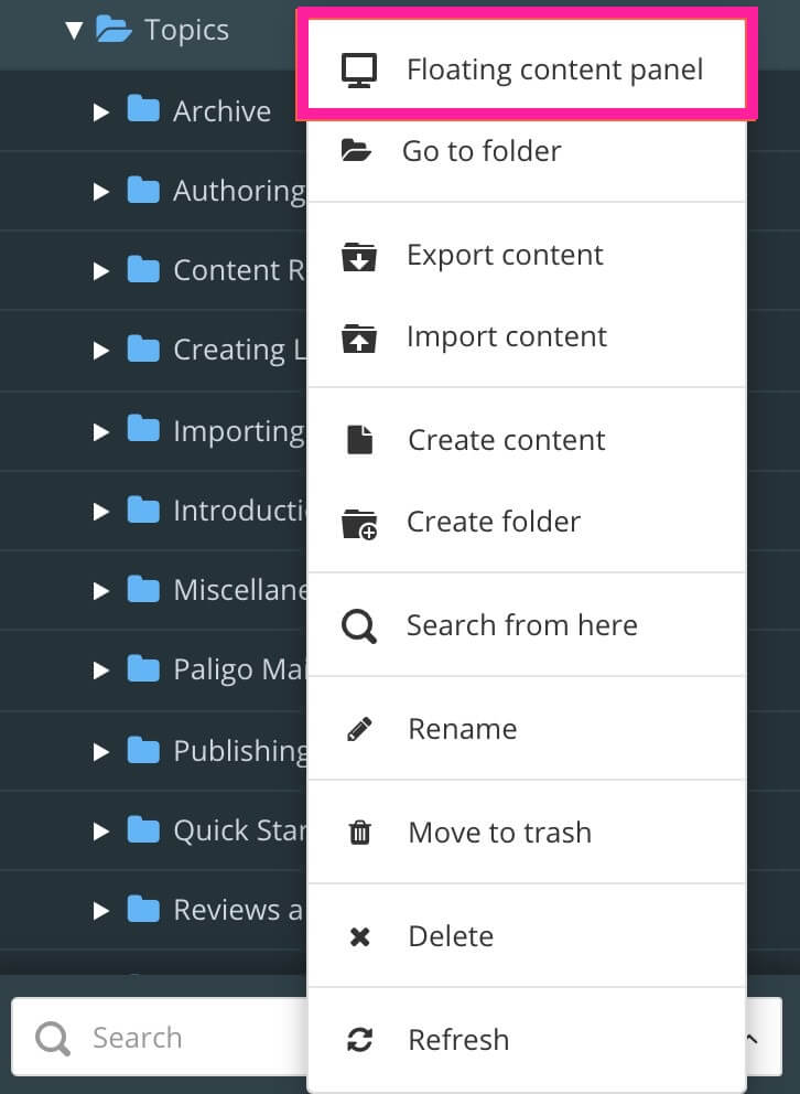
A floating content panel appears.
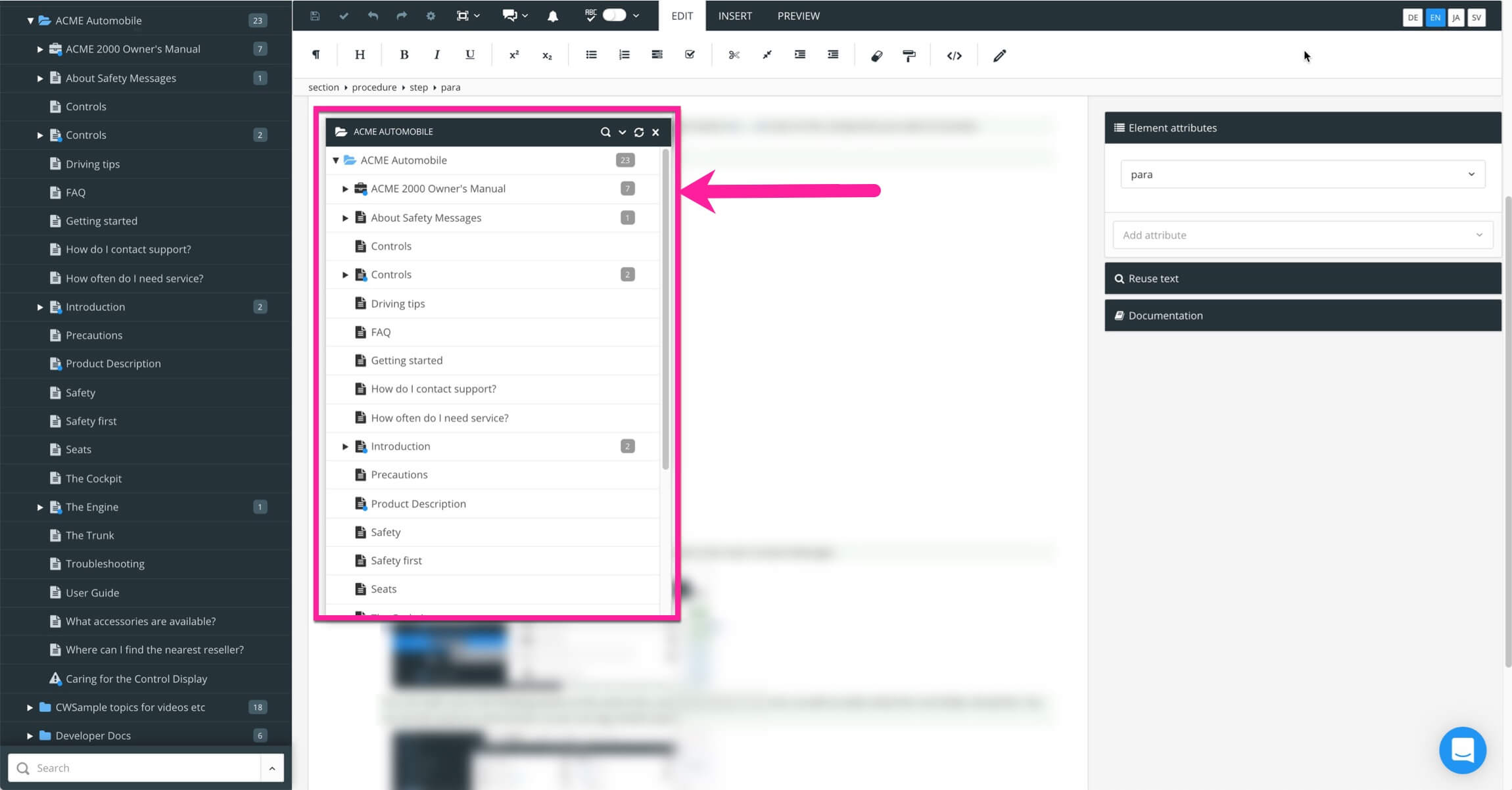
You can open up to five floating panels at the same time and can drag and drop content:
From the Content Manager to a floating content panel
From a floating content panel to the Content Manager
From a floating content panel to another floating content panel.
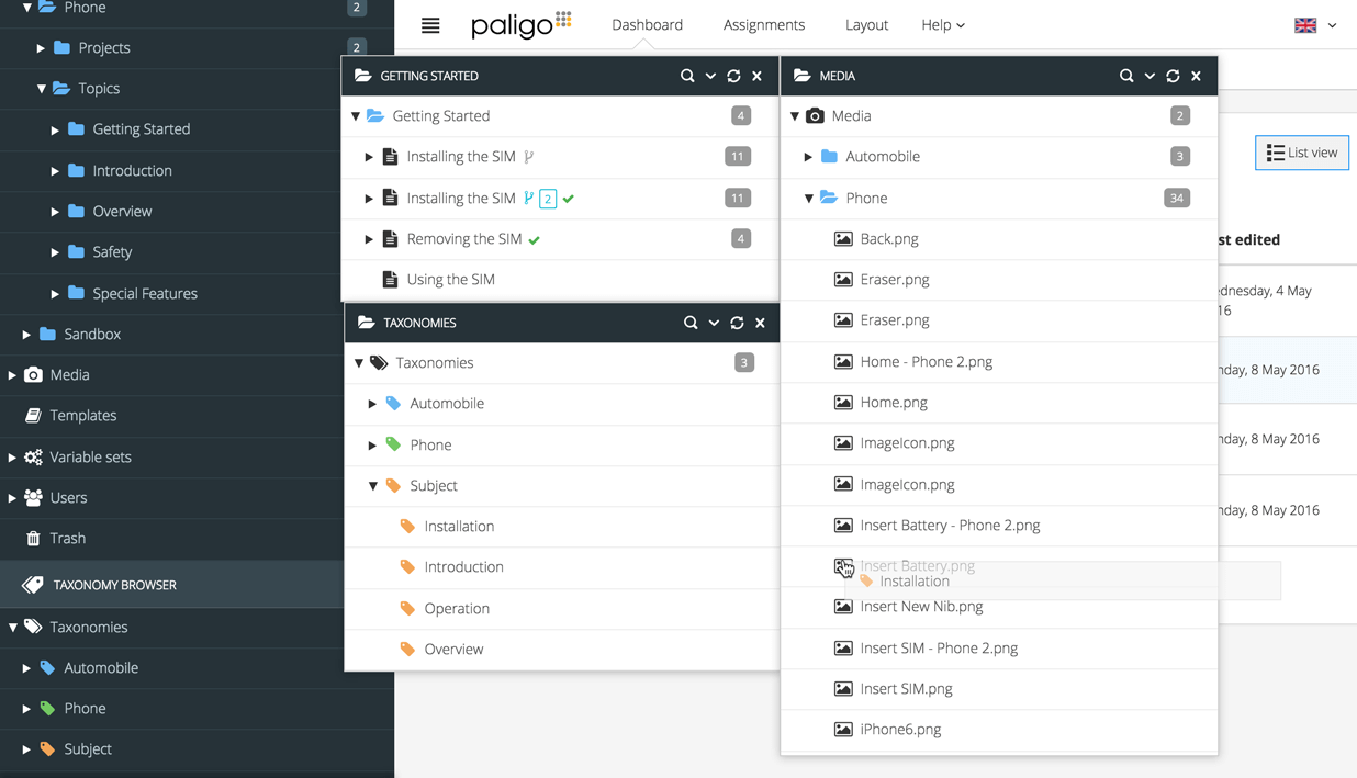 |
You can also move content around in a floating content panel. For example, you can move topics into a folder and move folders into other folders. The changes you make in a floating content panel are applied automatically to the content in the Content Manager.
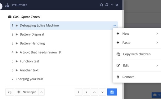
The Structure view contains three sections: Structure Section, Metadata Section and Preview Section.
You can use the Structure View to:
Add or remove content (topics or subpublications)
Organize the content.
View the metadata.
Get a quick preview of your content.
Convert a Component into a different type of component.
 |
Select the publication in the Content Manager.

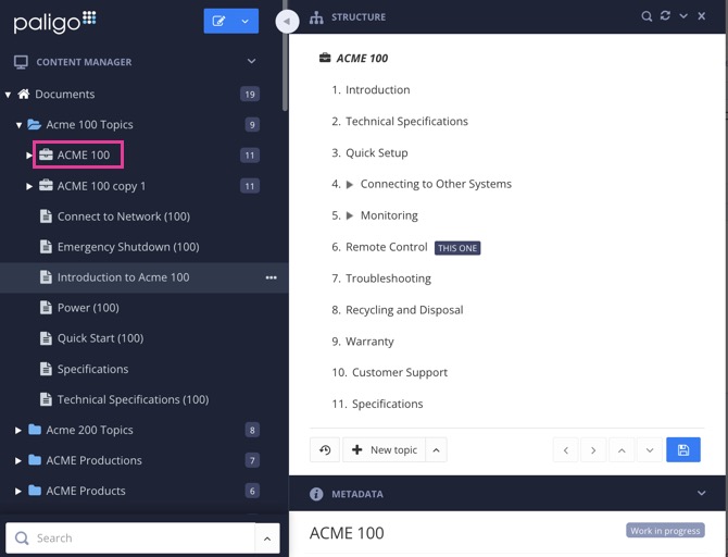
Paligo displays the Structure View, which consists of three sections: Structure, Metadata and Preview.
Close the Structure View with the X in the top right corner.
Tip
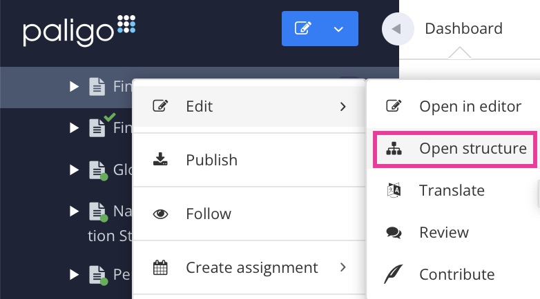
To be able to open the Structure View for a topic or component, you have to use the the dotted menu (...) to its right and select Edit and Open Structure. 
The Structure is the top section of the Structure View and is mostly used for Publications. This is where you create the structure of your publications by adding and reusing topics and other components. Think of building your publication structure as creating a table of contents for your publication. You drag and drop the topics you want to include and then organize them into a hierarchy to create the structure you want.
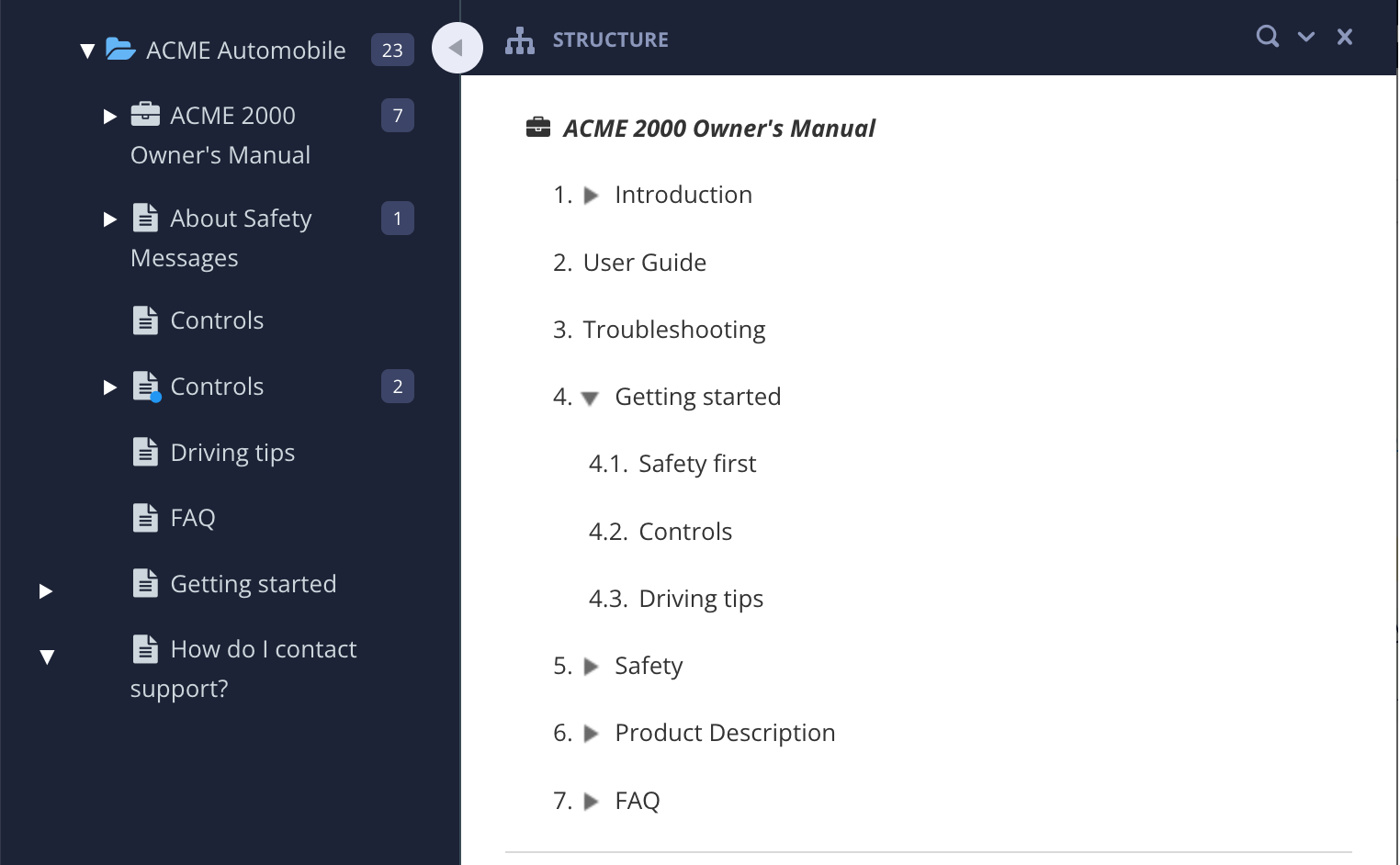 |
The Structure section, showing the structure of a publication. The publication has topics nested inside it.
The Structure View has options for Organize a Publication and Remove Content from a Publication and Create a Topic from Structure View.
Tip
You can use a keyboard shortcut to expand the structure to show all lower-level topics under a topic, no matter how deeply nested:
Press Shift ⇧ + Option ⌥ and then select the arrow
 next to the parent topic. (Mac)
Press Shift ⇧ + Alt and then select the arrow
 next to the parent topic. (Windows)
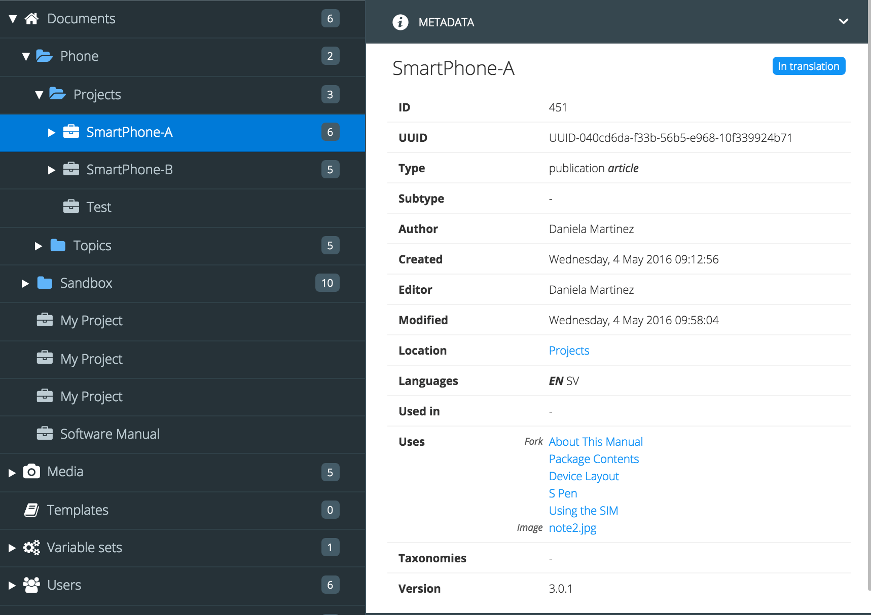
The Metadata is the middle section of the Structure View and shows information (metadata) about the publication, topic, or component, including:
The author of the component
The creation date
The workflow status (Work in Progress, Released, etc.)
Used in (where the component is used, whether it is reused there or being linked to by a cross-reference)
Which publications a component is reused in (Related Publications)
The location of the component.
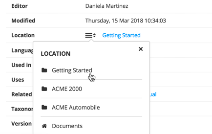
The location widget shows the full path, with a link. You can select the link to open the location.
 |
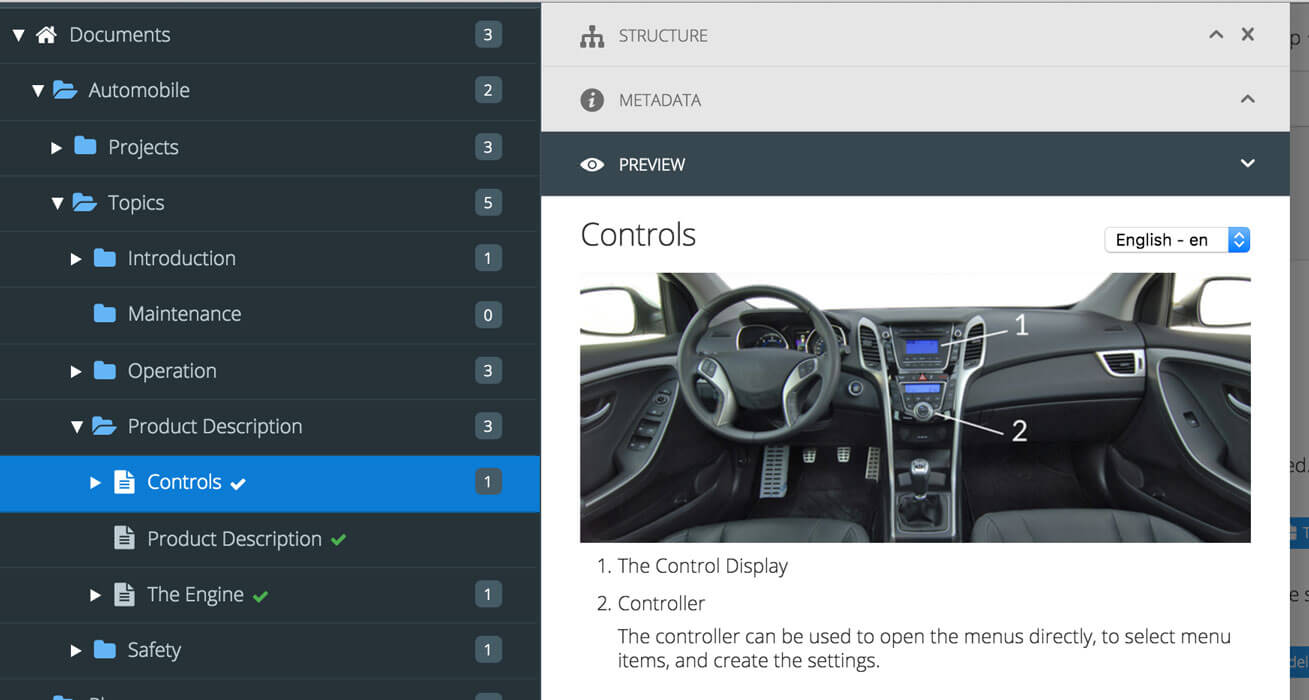
The Preview is the bottom section of the Structure View and it provides you a convenient way to view the content of a topic, without having to open it in the editor.
 |
Note
The preview feature is not available for certain components, such as informal topics. To preview an informal topic, add it to a regular topic as a component and then preview the regular topic. (Select Insert and choose Component to add the informal topic.)
Use the Metadata Section to convert a component into a different type of component. This is much quicker than creating a new component and then moving the required content into it.
For example, let's say you have created a topic but you later realize that it would be more useful as an informal topic. By using the Subtype option in the topic's metadata, you can quickly convert it into an informal topic.
Note
Only administrators and authors can convert a component into a different type of component.
To convert a component into a different type of component:
Select the Dotted menu (...) to the right of the topic or component in the Content Manager.
Select Edit and choose Open structure.

Use the Subtype dropdown list to change the component type.
You can choose from any of the components in the list. Other components are not supported.
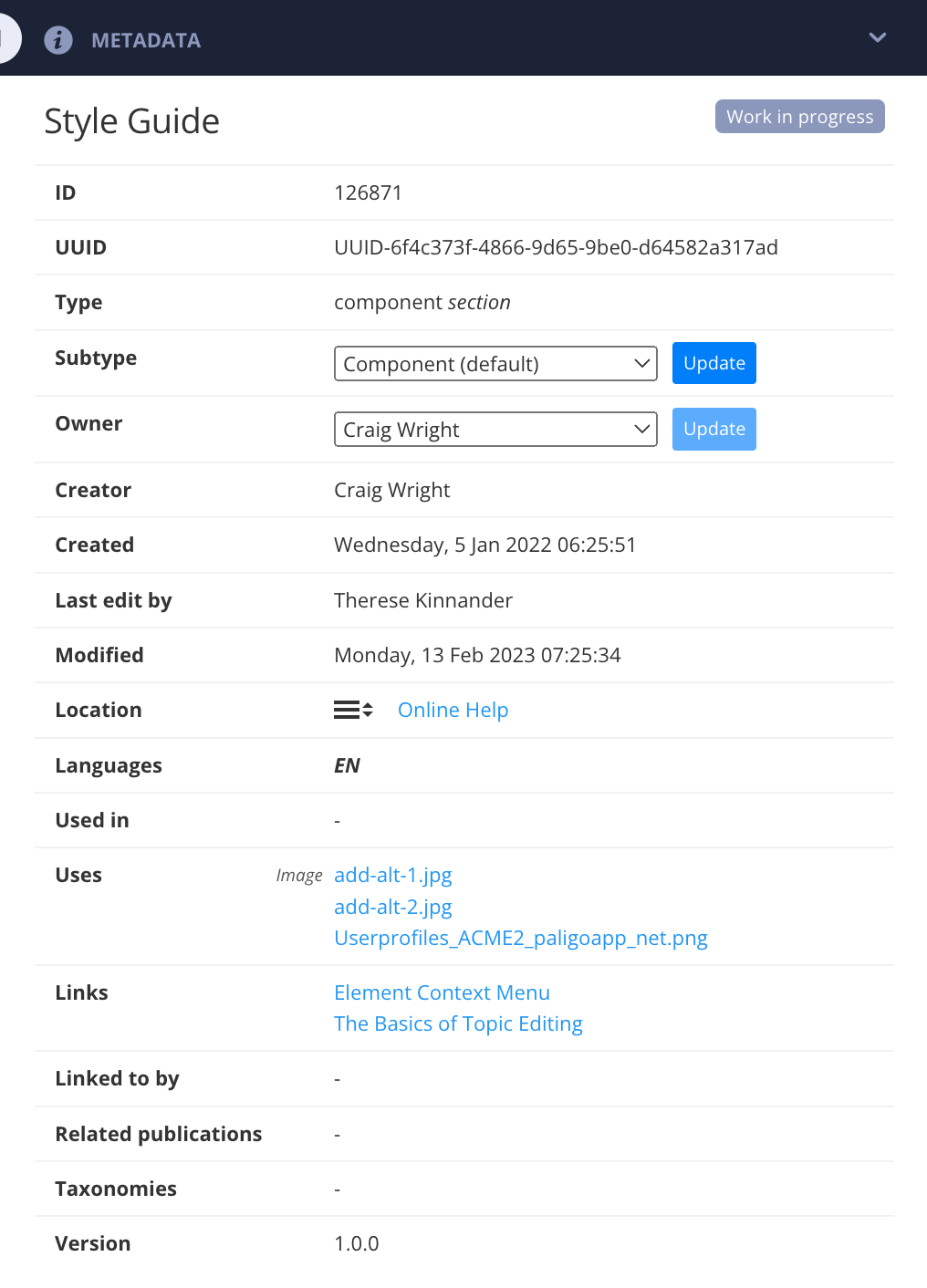
Select Update to apply the change.
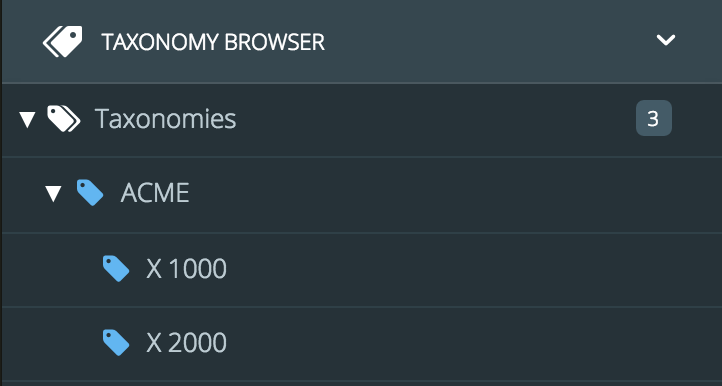
The Taxonomy Manager provides a powerful way to categorize, organize, and find content. The first step is to create the categories called taxonomies. The second step is to tag your content (topics, images, publications) with the taxonomies. You can categorize the content with any number of tags. Once the content is categorized, you can use the taxonomies to find and list content provided with a certain tag.
The advantage of taxonomies is that they are organized in a tree structure in the Content Manager. This makes it easier to keep track of the tags because they have a logical structure. But they also provide more intelligence, since you can tag a component with a high-level tag and find anything tagged with categories below it as well. This means that you easily find all content tagged with the same taxonomy in one place instead of searching through all available content. To learn more, see Taxonomies.
 |
Consider a topic that is a description of how to repair the engine on an ACME Model X1000 automobile. You could choose to create very different folder names for the location of this topic, for instance "Model X1000", "Maintenance and Repair", "Engine topics", etc.
What if the topic is reusable for not only X1000, but also for 3 or 4 other models, like the X2000, X3000?
What if you think the most intuitive way is to organize it by subject matter (such as "Maintenance and Repair"), but your colleagues disagree and would rather organize it by product model or type of product component?
With taxonomies you don't have to choose. You can tag it with any or all of these as categories. And the great thing about it is that you can also find it by any of these tags. Either way, the tagging will all lead to the same topic.
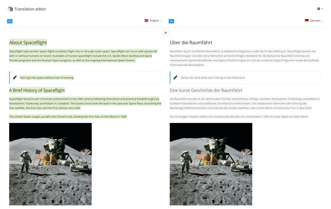
Paligo has its own built-in translation environment called the Translation View. You can use it to edit translations and manage translation assignments, see Working in Translation View.
It can also be used to perform simpler translations without translation memory. The translations are stored in the Paligo database with the matching source content. If you have reused content, any translations for that content are also reused.
This is a relatively simple editor with editing features and auto-translate which uses an online translation service. Using auto-translate can be a useful starting point for your translators, but we do not recommend that you rely on it entirely for your translations. You also have to keep track of changes manually. So if you add new content or change existing content in the source language, you will need to remember to update the translations too. To find out more about the workflow and how to get started with this approach, see Workflow for Internal Translation.
 |
Use the built-in translation editor if your organization is:
Unable to use an external translation service
Able to translate the content internally, without access to a professional translation software.
Important
If you are only making minor changes to the translation, such as fixing a typo or changing a product name, you could use both a translation service and Translation View, but it is a good idea to check this with your translation service first and you should only make minor changes that are unlikely to affect the translation overall. Because the content in Paligo and the translation memory will no longer be in sync. This can cause confusion and avoidable costs, as content that is not synced may be translated again.
If you are going to use Paligo for translating content inside your organization, see Work with Internal Translators.
For professional results and to make the translation process as efficient as possible, Paligo recommends that you use a translation service.


