Style Graphical Admonitions
If you have set Paligo to generate graphical admonitions, it will apply the styling choices from the General settings and the Graphical settings. The General settings take priority over the Graphical settings.
Here, we explain how to use the Graphical settings.
Note
To learn how to set Paligo to generate graphical admonitions, see Set the General Styles for Admonitions. That article also explains how to use the General settings.
To set the Graphical styles:
Select Layout in the top menu.

Paligo displays a list of Layouts. The list is empty if there are no custom Layouts in your Paligo instance.
Select the PDF Layout you are going to use for publishing. Alternatively, create a new one (see Create a Layout).
Select the Admonitions category and then select the Graphical subcategory.
Use Background color for Graphical admonitions to choose one color for all graphical admonitions.
Clear the Use default color checkbox to select a color of your own choice.
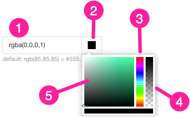
Set the color either by:
Entering an RGBA code for the color you want (1).
Selecting the Color square to display the color selector (2).
Choose the color with the spectrum bar (3).
Control the transparency with the opacity bar (4).
Choose the color shade with the main color panel (5).

Note
Paligo will only use the color you select here if the General category has the background colors set to default.
For example, let's say you select the General category and set Background color for 'Caution' to orange. You then go into the Graphical category and set Background color for graphical admonitions to blue. When you publish, your caution admonitions will have an orange background, as the General category takes priority over the Graphical category.
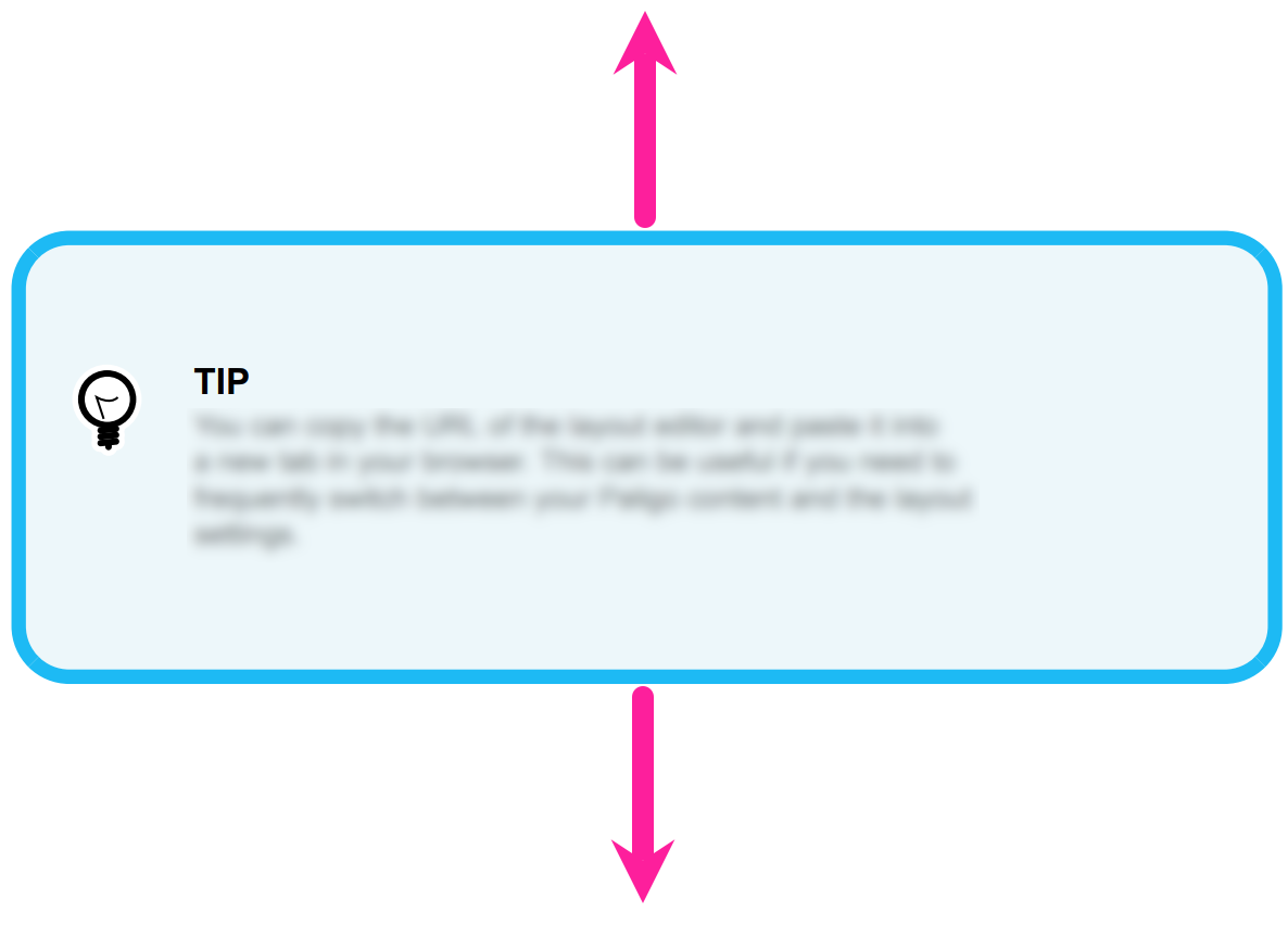
Use these settings to define the amount of space above and below graphical admonitions:
Space-before (optimum) for graphical admonitions
Use to set a preferred amount of space above graphical admonitions. This setting does not apply to admonitions inside lists and procedures.
Space-after (optimum) for graphical admonitions
Use to set a preferred amount of space below graphical admonitions. This setting does not apply to admonitions inside lists and procedures.
Space-before (optimum) for graphical admonitions in list items and steps
Use to set a preferred amount of space above graphical admonitions that appear in a list or procedure.
Space-after (optimum) for graphical admonitions in list items and steps
Use to set a preferred amount of space below graphical admonitions that appear in a list or procedure.

For all of these settings, enter a scaling value. Paligo uses the value in relation to the size of body text in your PDF. For example, if you enter 2.5, Paligo will add spacing that is 2.5 times bigger than the body text size. If you enter 0.5, Paligo will add spacing that is half the size of the body text.
Paligo will try to apply the preferred amount of space, but in some cases may need to use less. For example, a page break might result in Paligo applying different spacing.
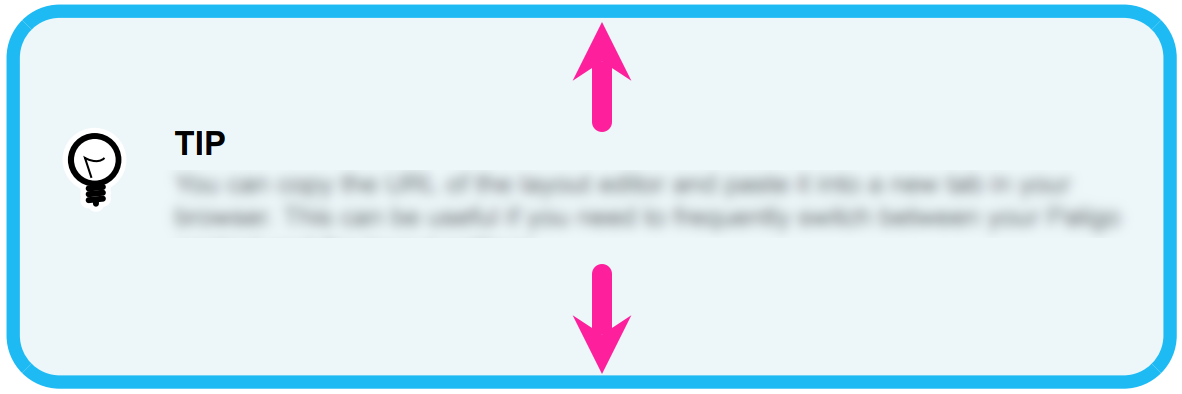
Use the following settings to define the amount of space inside the graphical admonitions. This is the "padding".
Padding-top for graphical admonitions
Enter the amount of space between the top of the admonition box and the top of the title (or body text if there is no title). Enter a value and the units of measurement, for example, 2em.
Padding-bottom for graphical admonitions
Enter the amount of space between the bottom of the admonition box and the bottom of the body text. Enter a value and its units of measurement, for example, 2em.

Use these settings to set margins for graphical admonitions. The margins apply to the whole admonition, not just the content inside it.
Margin-left for graphical admonitions
Sets the left-side indent for all graphical admonitions.
Margin-right for graphical admonitions
Sets the right-side indent for all graphical admonitions.
For both settings, enter a value and the units of measurement, for example, 2cm.

Note
When setting a margin, consider the amount of space available on the page of your PDF.
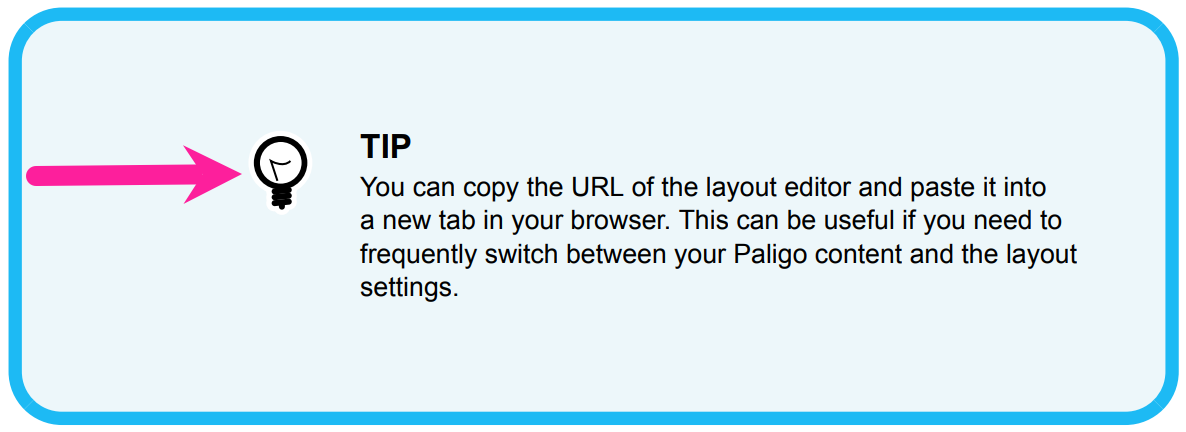
Use the Margin-left for graphical admonition icon setting to control the position of the admonition icons. Enter a value and the units of measurement, for example, 1.5em. Paligo applies the margin from the default position of an icon.

Note
The icon can overlap the text and title. If you change the icon margin, you may also need to change the title and body text margins.
Set the Border width for graphical admonitions. This is the thickness of the border line around the edge of the admonition box. It applies to all types of admonition, such as note, caution, and warning.
Enter a value and the units of measurement, for example, 0.5pt.
Choose the Border style for graphical admonitions from the list. The options are:
Set the Border color for graphical admonitions.
Again, to choose your own color, clear the Use default color checkbox and then use the color selector to set the color.
Use the Border radius for graphical admonitions setting to set the amount of curve on the corners of the border box. Set it to 0pt for no curves or enter a value and a unit of measurement to add curves. For example, you could use 10pt to give the box curved corners.

Use Admonition icon width to set the size of the admonition icons.
Enter a value and the units of measurement, for example, 24pt. Paligo will set the width of the icon image container and will scale the image to fit. When it scales the image, Paligo keeps the aspect ratio so that the image is not stretched in height or width.
Use the following settings to upload an icon graphic for each type of admonition. We recommend that you use graphics that are square and the same size (or close to) that you want them to be in your output.
Icon for 'Note'
Icon for 'Notice'
Icon for 'Warning'
Icon for 'Danger'
Icon for 'Caution'
Icon for 'Important'
Icon for 'Tip'
For each setting, select the Upload button to display an image upload dialog. Drag the image file on to the dialog.
Select Save.
When you use this Layout to publish to PDF, Paligo will apply your choices.