Set the General Styles for Admonitions
The General admonition styles are designed to apply to graphical and non-graphical admonitions. You should set your general preferences and then use the Graphical or Nongraphical settings to apply further styles for those types of admonition.
Select Layout in the top menu.

Paligo displays a list of Layouts. The list is empty if there are no custom Layouts in your Paligo instance.
Select the PDF Layout you are going to use for publishing. Alternatively, create a new one (see Create a Layout).
Select the Admonitions category and then select the General subcategory.
Choose whether the admonitions will use graphical icons.
Set Use graphics in admonitions to:
Enabled to include a graphical icon in admonitions. For styling, Paligo will use a combination of the admonition General and admonition Graphical settings. It will ignore the Nongraphical settings.

Disabled for admonitions without graphical icons. For styling, Paligo will use a combination of the admonition General and admonition Nongraphical settings. It will ignore the Graphical settings.

Default to inherit the value for this setting from the base Layout. The base Layout is either a built-in Layout provided by Paligo or another custom Layout, see Layout Relationships - Base, New, Duplicate.
Choose whether Paligo will add a
titleto any admonition that does not already have atitle. Set Use auto-title in admonitions to:Activate to get Paligo to generate a title. The title is the name of the admonition type, for example, Note, and is translated automatically into the relevant languages.
Deactivate to prevent Paligo from generating titles automatically.
Default to inherit the value for this setting from the base Layout. The base Layout is either a built-in Layout provided by Paligo or another custom Layout, see Layout Relationships - Base, New, Duplicate.
Set the Default font family for admonition text. This is the style of lettering for each admonition's main body content.
Choose a typeface from the list of available fonts.
Set the Default font size for admonition text. This is the size of the main body text in each admonition.
Set the Default font size for admonition title. This is the size of the text in each admonition's
titleelement.Set the Capitalization for admonition title. This controls whether title characters are shown in upper case, lower case, or a combination of the two.
Set the left and right margins for the main body text of your admonitions.
Margin-left for admonitions body
Use to set a left-side indent for the body text of admonitions. Enter a value and its units of measurement, for example, 16pt.
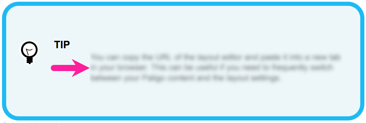
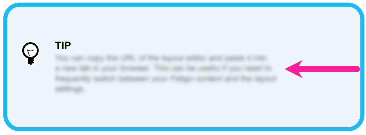
Margin-right for admonitions body
Use to set a right-side indent for the body text of admonitions. Enter a value and its units of measurement, for example, 16pt.
Set the margins for the admonition titles.
Margin-left for admonition title
Use to set a left-side indent for the title of admonitions. Enter a value and its units of measurement, for example, 16pt.
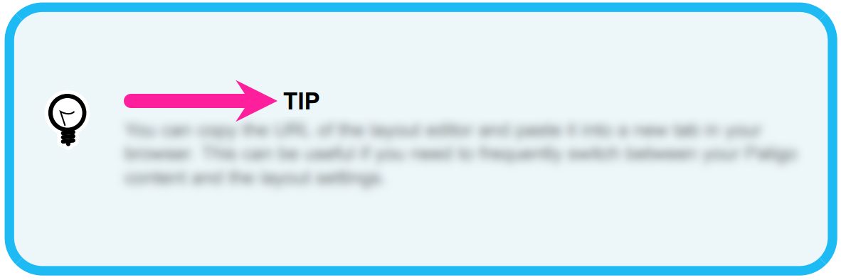
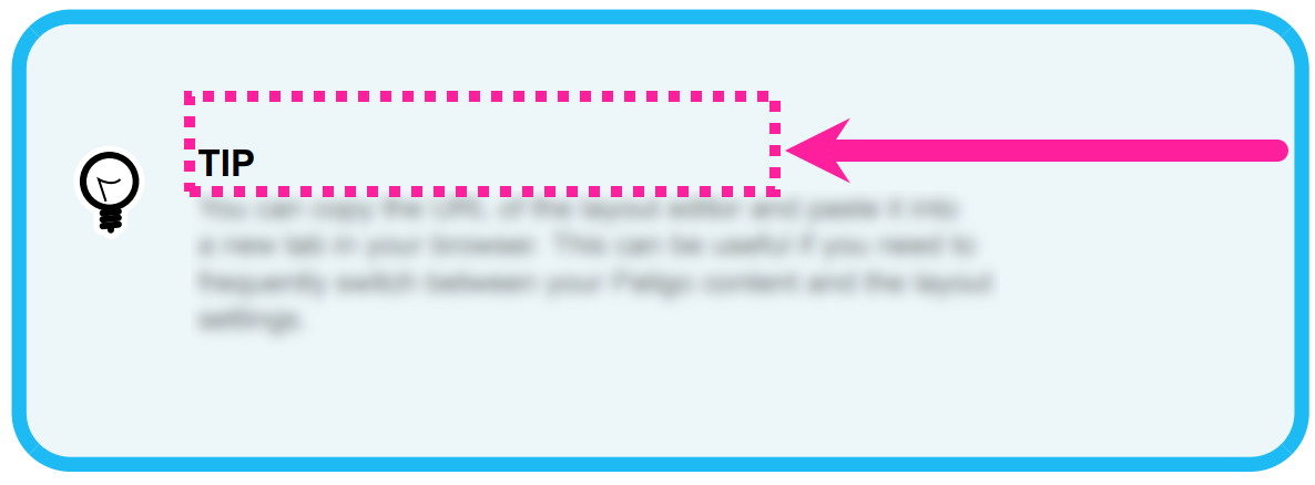
Margin-right for admonition title
Use to set a right-side indent for the title of admonitions. Enter a value and its units of measurement, for example, 16pt.
Note
If you have short titles for your admonitions, you may not be able to see the effect of the margin. This is because the title text will not extend across the admonition box far enough to reach the margin.
Use the following settings to set a background color for each type of admonition.
Background color for 'Note'
Background color for 'Notice'
Background color for 'Warning'
Background color for 'Danger'
Background color for 'Caution'
Background color for 'Tip'
Background color for 'Important'
Clear the Use default color checkbox to select a color of your own choice.
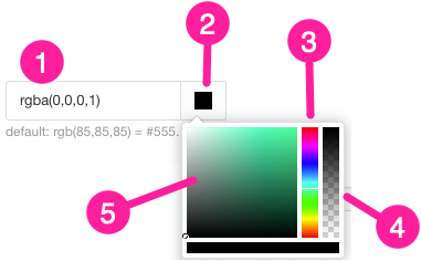
Set the color either by:
Entering an RGBA code for the color you want (1).
Selecting the Color square to display the color selector (2).
Choose the color with the spectrum bar (3).
Control the transparency with the opacity bar (4).
Choose the color shade with the main color panel (5).
Use the following settings to set the text color for the various types of admonition.
Font color for 'Note'
Font color for 'Notice'
Font color for 'Warning'
Font color for 'Danger'
Font color for 'Caution'
Font color for 'Tip'
Font color for 'Important'
Again, clear the Use default color checkbox for each color that you want to set. Use the color box to display the color selector and choose the color you want.
Select Save.
You have now set the General settings for your admonitions. If you have chosen to use graphical admonitions, you can apply more settings in the Graphical category. If you have chosen to use non-graphical admonitions, you can apply more settings in the Nongraphical category. The General settings take priority over the Graphical and Nongraphical settings.
When you use this Layout to publish to PDF, Paligo will apply your choices to the admonitions in your content.