
Admonition Styling (PDF)

Use the PDF Layout's Admonition settings (General, Graphical, and Nongraphical) to change the appearance of notes, warnings, cautions, and other admonitions.

Close-up of PDF Layout's Admonitions settings. There is an Admonitions category and it has General, Graphical, and Nongraphical subcategories.

Before you start editing the admonition styles, we recommend you read Which Admonition Parts Can You Style?.

The PDF layout has Admonitions settings for styling the notes, cautions, and other admonitions in your PDF outputs. Use the settings to style the various parts of an admonition:

A caution admonition. It has two columns. The left column is narrower and contains a symbol. The right column has a title and the text for the admonition. The background of the admontion is yellow. There is a callout number 1 above the left column. A 2 is next to the symbol, a 3 next to the title, a 4 next to the text, and a 5 on the background.
  1. The spacing around the admonition

  2. The icon for graphical admonitions

  3. The title

  4. The body text

  5. The admonition box (the container that the icon, title, and text are inside).

The Admonitions settings are divided into three categories:

  • General

    The General settings apply to all admonitions in your PDF output. It is here that you tell Paligo to use graphical or nongraphical admonitions.

  • Graphical

    The Graphical settings only apply to admonitions if the layout is set to use graphical admonitions (which it is by default).

    Graphical admonitions have a box that, by default, contains two columns. The left-side column is narrower and contains an icon that represents the type of admonition. The right-side column contains the title and body text.

  • Nongraphical

    The Nongraphical settings only apply to admonitions when you have set the layout to use non-graphical admonitions.

    Non-graphical admonitions have a single column with a title, body text and no icon.

You will need to use the settings in the General category and one of the other categories, depending on whether you want graphical or nongraphical admonitions.

The General admonition styles are designed to apply to graphical and non-graphical admonitions. You should set your general preferences and then use the Graphical or Nongraphical settings to apply further styles for those types of admonition.

  1. Select Layout in the top menu.

    Paligo editor. The Layout option in the header menu is highlighted.

    Paligo displays a list of Layouts. The list is empty if there are no custom Layouts in your Paligo instance.

  2. Select the PDF Layout you are going to use for publishing. Alternatively, create a new one (see Create a Layout).

  3. Select the Admonitions category and then select the General subcategory.

  4. Choose whether the admonitions will use graphical icons.

    Set Use graphics in admonitions to:

    • Enabled to include a graphical icon in admonitions. For styling, Paligo will use a combination of the admonition General and admonition Graphical settings. It will ignore the Nongraphical settings.

      Warning admonition. In the left column is a warning symbol. In the right column is a title "Warning" and below that, the text of the warning.
    • Disabled for admonitions without graphical icons. For styling, Paligo will use a combination of the admonition General and admonition Nongraphical settings. It will ignore the Graphical settings.

      A warning admonition. It has no symbol and no background color. It only has a title "Warning" and below that, the text for the warning message.
    • Default to inherit the value for this setting from the base Layout. The base Layout is either a built-in Layout provided by Paligo or another custom Layout, see Layout Relationships - Base, New, Duplicate.

  5. Choose whether Paligo will add a title to any admonition that does not already have a title. Set Use auto-title in admonitions to:

    • Activate to get Paligo to generate a title. The title is the name of the admonition type, for example, Note, and is translated automatically into the relevant languages.

    • Deactivate to prevent Paligo from generating titles automatically.

    • Default to inherit the value for this setting from the base Layout. The base Layout is either a built-in Layout provided by Paligo or another custom Layout, see Layout Relationships - Base, New, Duplicate.

  6. Set the Default font family for admonition text. This is the style of lettering for each admonition's main body content.

    Choose a typeface from the list of available fonts.

  7. Set the Default font size for admonition text. This is the size of the main body text in each admonition.

  8. Set the Default font size for admonition title. This is the size of the text in each admonition's title element.

  9. Set the Capitalization for admonition title. This controls whether title characters are shown in upper case, lower case, or a combination of the two.

  10. Set the left and right margins for the main body text of your admonitions.

    • Margin-left for admonitions body

      Use to set a left-side indent for the body text of admonitions. Enter a value and its units of measurement, for example, 16pt.

      A tip admonition. There is an icon inside the tip box and it is on the left. Next to it is the title "TIP" and next to that is the body text. An arrow points to the space between the start of the title and the start of the body text.
    • Margin-right for admonitions body

      Use to set a right-side indent for the body text of admonitions. Enter a value and its units of measurement, for example, 16pt.

      A tip admonition. There is an icon inside the tip box and it is on the left. Next to it is the title "TIP" and below that is the body text. An arrow points to the space between the right edge of the admonition box and the right edge of the body text.
  11. Set the margins for the admonition titles.

    • Margin-left for admonition title

      Use to set a left-side indent for the title of admonitions. Enter a value and its units of measurement, for example, 16pt.

      A tip admonition. There is an icon inside the tip box and it is on the left. Next to it is the title "TIP" and it is approximately a third across the box. The body text is below it, but is closer to the icon. An arrow points at the space between the icon and the start of the title "Tip"
    • Margin-right for admonition title

      Use to set a right-side indent for the title of admonitions. Enter a value and its units of measurement, for example, 16pt.

      A tip admonition. There is an icon inside the tip box and it is on the left. Next to it is the title "TIP" and below that, the body text. An arrow points to the space between the right edge of the box and the title area.

      Note

      If you have short titles for your admonitions, you may not be able to see the effect of the margin. This is because the title text will not extend across the admonition box far enough to reach the margin.

  12. Use the following settings to set a background color for each type of admonition.

    • Background color for 'Note'

    • Background color for 'Notice'

    • Background color for 'Warning'

    • Background color for 'Danger'

    • Background color for 'Caution'

    • Background color for 'Tip'

    • Background color for 'Important'

    1. Clear the Use default color checkbox to select a color of your own choice.

    2. Set the color either by:

      • Entering an RGBA code for the color you want (1).

      • Selecting the Color square to display the color selector (2).

        1. Choose the color with the spectrum bar (3).

        2. Control the transparency with the opacity bar (4).

        3. Choose the color shade with the main color panel (5).

        Color selector. There is a field for entering an rgba value. It is labelled 1. There is a black square labelled 2. There is a popup dialog that contains three sections. The sections are labelled with numbers. Label 3 points to a narrow bar that shows the colors of the spectrum. Label 4 points towards an opacity bar ranging from black to transparent. Label 5 points to a color selector with various shades of a single color.
  13. Use the following settings to set the text color for the various types of admonition.

    • Font color for 'Note'

    • Font color for 'Notice'

    • Font color for 'Warning'

    • Font color for 'Danger'

    • Font color for 'Caution'

    • Font color for 'Tip'

    • Font color for 'Important'

    Again, clear the Use default color checkbox for each color that you want to set. Use the color box to display the color selector and choose the color you want.

  14. Select Save.

You have now set the General settings for your admonitions. If you have chosen to use graphical admonitions, you can apply more settings in the Graphical category. If you have chosen to use non-graphical admonitions, you can apply more settings in the Nongraphical category. The General settings take priority over the Graphical and Nongraphical settings.

When you use this Layout to publish to PDF, Paligo will apply your choices to the admonitions in your content.

If you have set Paligo to generate graphical admonitions, it will apply the styling choices from the General settings and the Graphical settings. The General settings take priority over the Graphical settings.

Here, we explain how to use the Graphical settings.

Note

To learn how to set Paligo to generate graphical admonitions, see Set the General Styles for Admonitions. That article also explains how to use the General settings.

To set the Graphical styles:

  1. Select Layout in the top menu.

    Paligo editor. The Layout option in the header menu is highlighted.

    Paligo displays a list of Layouts. The list is empty if there are no custom Layouts in your Paligo instance.

  2. Select the PDF Layout you are going to use for publishing. Alternatively, create a new one (see Create a Layout).

  3. Select the Admonitions category and then select the Graphical subcategory.

  4. Use Background color for Graphical admonitions to choose one color for all graphical admonitions.

    1. Clear the Use default color checkbox to select a color of your own choice.

    2. Set the color either by:

      • Entering an RGBA code for the color you want (1).

      • Selecting the Color square to display the color selector (2).

        1. Choose the color with the spectrum bar (3).

        2. Control the transparency with the opacity bar (4).

        3. Choose the color shade with the main color panel (5).

        Color selector. There is a field for entering an rgba value. It is labelled 1. There is a black square labelled 2. There is a popup dialog that contains three sections. The sections are labelled with numbers. Label 3 points to a narrow bar that shows the colors of the spectrum. Label 4 points towards an opacity bar ranging from black to transparent. Label 5 points to a color selector with various shades of a single color.

    Note

    Paligo will only use the color you select here if the General category has the background colors set to default.

    For example, let's say you select the General category and set Background color for 'Caution' to orange. You then go into the Graphical category and set Background color for graphical admonitions to blue. When you publish, your caution admonitions will have an orange background, as the General category takes priority over the Graphical category.

  5. Use these settings to define the amount of space above and below graphical admonitions:

    • Space-before (optimum) for graphical admonitions

      Use to set a preferred amount of space above graphical admonitions. This setting does not apply to admonitions inside lists and procedures.

    • Space-after (optimum) for graphical admonitions

      Use to set a preferred amount of space below graphical admonitions. This setting does not apply to admonitions inside lists and procedures.

    • Space-before (optimum) for graphical admonitions in list items and steps

      Use to set a preferred amount of space above graphical admonitions that appear in a list or procedure.

    • Space-after (optimum) for graphical admonitions in list items and steps

      Use to set a preferred amount of space below graphical admonitions that appear in a list or procedure.

    A tip admonition. There are arrows pointing at the space above and below the admonition.

    For all of these settings, enter a scaling value. Paligo uses the value in relation to the size of body text in your PDF. For example, if you enter 2.5, Paligo will add spacing that is 2.5 times bigger than the body text size. If you enter 0.5, Paligo will add spacing that is half the size of the body text.

    Paligo will try to apply the preferred amount of space, but in some cases may need to use less. For example, a page break might result in Paligo applying different spacing.

  6. Use the following settings to define the amount of space inside the graphical admonitions. This is the "padding".

    • Padding-top for graphical admonitions

      Enter the amount of space between the top of the admonition box and the top of the title (or body text if there is no title). Enter a value and the units of measurement, for example, 2em.

    • Padding-bottom for graphical admonitions

      Enter the amount of space between the bottom of the admonition box and the bottom of the body text. Enter a value and its units of measurement, for example, 2em.

    A tip admonition. There is an icon and next to that the title. Below the title is the body text. There are arrows pointing at the space above the tip and below the body text.
  7. Use these settings to set margins for graphical admonitions. The margins apply to the whole admonition, not just the content inside it.

    • Margin-left for graphical admonitions

      Sets the left-side indent for all graphical admonitions.

    • Margin-right for graphical admonitions

      Sets the right-side indent for all graphical admonitions.

    For both settings, enter a value and the units of measurement, for example, 2cm.

    A tip admonition. There are arrows pointing at the space to the left of the admonition (outside its box) and to the right of the admonition (outside of its box).

    Note

    When setting a margin, consider the amount of space available on the page of your PDF.

  8. Use the Margin-left for graphical admonition icon setting to control the position of the admonition icons. Enter a value and the units of measurement, for example, 1.5em. Paligo applies the margin from the default position of an icon.

    A tip admonition. It has an icon and next to that the title. The body text is below the title. An arrow points at the space between the left edge of the admonition box and the icon.

    Note

    The icon can overlap the text and title. If you change the icon margin, you may also need to change the title and body text margins.

  9. Set the Border width for graphical admonitions. This is the thickness of the border line around the edge of the admonition box. It applies to all types of admonition, such as note, caution, and warning.

    Enter a value and the units of measurement, for example, 0.5pt.

  10. Choose the Border style for graphical admonitions from the list. The options are:

  11. Set the Border color for graphical admonitions.

    Again, to choose your own color, clear the Use default color checkbox and then use the color selector to set the color.

  12. Use the Border radius for graphical admonitions setting to set the amount of curve on the corners of the border box. Set it to 0pt for no curves or enter a value and a unit of measurement to add curves. For example, you could use 10pt to give the box curved corners.

    Close up view of the corner of a tip admonition. Its border line is curved where the horizontal top line meets the vertical side line.
  13. Use Admonition icon width to set the size of the admonition icons.

    Enter a value and the units of measurement, for example, 24pt. Paligo will set the width of the icon image container and will scale the image to fit. When it scales the image, Paligo keeps the aspect ratio so that the image is not stretched in height or width.

  14. Use the following settings to upload an icon graphic for each type of admonition. We recommend that you use graphics that are square and the same size (or close to) that you want them to be in your output.

    • Icon for 'Note'

    • Icon for 'Notice'

    • Icon for 'Warning'

    • Icon for 'Danger'

    • Icon for 'Caution'

    • Icon for 'Important'

    • Icon for 'Tip'

    For each setting, select the Upload button to display an image upload dialog. Drag the image file on to the dialog.

  15. Select Save.

When you use this Layout to publish to PDF, Paligo will apply your choices.

If you have set Paligo to generate nongraphical admonitions, it will apply the styling choices from the General settings and the Nongraphical settings. The General settings take priority over the Nongraphical settings.

Here, we explain how to use the Nongraphical settings.

Note

To learn how to set Paligo to generate nongraphical admonitions, see Set the General Styles for Admonitions. That article also explains how to use the General settings.

To set the Nongraphical styles:

  1. Select Layout in the top menu.

    Paligo editor. The Layout option in the header menu is highlighted.

    Paligo displays a list of Layouts. The list is empty if there are no custom Layouts in your Paligo instance.

  2. Select the PDF Layout you are going to use for publishing. Alternatively, create a new one (see Create a Layout).

  3. Select the Admonitions category and then select the Nongraphical subcategory.

  4. Choose whether Paligo should allow an admonition to have a user-defined title and an auto-generated title.

    In the General settings for admonitions, there is a Use auto-title in admonitions setting. When it is set to Activate, Paligo will generate automatic titles for your admonitions, such as "Note" and "Caution". The auto-generated titles will replace any existing titles, by default. But if you prefer, you can set Paligo to include both auto-generated titles and manually-added titles.

    admonition-autogen-title-and-usertitle.png

    Example of an admonition that has an auto-generated title (Caution) and a user-defined title (Risk of injury)

    Set the Render label on a separate line for nongraphical admonitions setting to:

    • Enabled to allow a user-defined title and an auto-generated title

    • Disabled to only allow one title. If Use auto-title in admonitions is set to Activate, Paligo will generate titles for your admonitions. Any existing titles are ignored.

    • Default to inherit the value for this setting from the base Layout. The base Layout is either a built-in Layout provided by Paligo or another custom Layout, see Layout Relationships - Base, New, Duplicate.

  5. Use Background color for nongraphical admonitions to choose one color for all nongraphical admonitions.

    1. Clear the Use default color checkbox to select a color of your own choice.

    2. Set the color either by:

      • Entering an RGBA code for the color you want (1).

      • Selecting the Color square to display the color selector (2).

        1. Choose the color with the spectrum bar (3).

        2. Control the transparency with the opacity bar (4).

        3. Choose the color shade with the main color panel (5).

        Color selector. There is a field for entering an rgba value. It is labelled 1. There is a black square labelled 2. There is a popup dialog that contains three sections. The sections are labelled with numbers. Label 3 points to a narrow bar that shows the colors of the spectrum. Label 4 points towards an opacity bar ranging from black to transparent. Label 5 points to a color selector with various shades of a single color.

    Note

    Paligo will only use the color you select here if the General category has the background colors set to default.

    For example, let's say you select the General category and set Background color for 'Caution' to orange. You then go into the Nongraphical category and set Background color for graphical admonitions to blue. When you publish, your caution admonitions will have an orange background, as the General category takes priority over the Nongraphical category.

  6. Set the amount of space above (before) and below (after) the nongraphical admonitions.

    • Space-before (optimum) for nongraphical admonitions

    • Space-after (optimum) for nongraphical admonitions

    Enter an amount, relative to the body font size in the following fields. For example, 1.2. Do not include any units of measurement as the size is always relative to the body font size.

    A paragraph followed by a large space and then a note. After the note, there is another large space and then a paragraph. Double ended arrows highlight the two large spaces.
  7. Set the amount of padding for nongraphical admonitions. The padding is the internal margin between the content in the admonition and the boundaries of the admonition box.

    Enter an amount and the units of measurement in the following fields:

    • Padding-top for nongraphical admonitions

      Use to set the amount of space above the title of nongraphical admonitions. This space applies to the body text if there is no title.

    • Padding-bottom for nongraphical admonitions

      Use to set the amount of space below the body text of nongraphical admonitions.

    A note. A double-headed arrow highlights the space between the title and the top of the note box. Another double-headed arrow highlights the space between the paragraph of the note and the bottom of the note box.
  8. Use the margin settings to set left and right indents for nongraphical admonitions. The margins apply to the admonitions as a whole, not the content inside it.

    A note admonition. The admonition box is indented from the edges on both sides. Double-headed arrows highlight the space to the left and the space to the right. These spaces are the margins.
    • Margin-left for nongraphical admonitions

      Sets the left-side indent for all nongraphical admonitions.

    • Margin-right for nongraphical admonitions

      Sets the right-side indent for all nongraphical admonitions.

    For both settings, enter a value and the units of measurement, for example, 2cm.

  9. Select Save.

When you use this Layout to publish to PDF, Paligo will apply your chosen settings.

Set the Admonition Spacing for PDF

Abstract

Learn how to control the spacing for admonitions in PDF outputs. Set the margins and the padding to control the space inside an admonition.

To control the spacing around admonitions in PDF outputs, use the margin settings in the PDF layout. The layout also has padding settings for controlling the spacing inside the admonition.

  1. Select Layout in the top menu.

    Paligo editor. The Layout option in the header menu is highlighted.

    Paligo displays a list of Layouts. The list is empty if there are no custom Layouts in your Paligo instance.

  2. Select the Layout you want to update or Create a Layout.

    Tip

    You can copy the URL of the Layout Editor and paste it into a new tab in your browser. This can be useful if you frequently switch between your Paligo content and the Layout settings.

  3. Select Admonitions.

  4. Select General.

  5. Use these settings to define the side margins for the text inside your admonitions:

    • Margin-left for admonitions body

      Use to set a left-side indent for the body text of admonitions. Enter a value and its units of measurement, for example, 16pt.

      A tip admonition. There is an icon inside the tip box and it is on the left. Next to it is the title "TIP" and next to that is the body text. An arrow points to the space between the start of the title and the start of the body text.
    • Margin-right for admonitions body

      Use to set a right-side indent for the body text of admonitions. Enter a value and its units of measurement, for example, 16pt.

      A tip admonition. There is an icon inside the tip box and it is on the left. Next to it is the title "TIP" and below that is the body text. An arrow points to the space between the right edge of the admonition box and the right edge of the body text.

    For both settings, enter a value and include the units of measurement, for example, 16pt. Paligo applies the indent from the default position of the body text.

  6. Use these settings to define the side margins for the titles in your admonitions:

    • Margin-left for admonition title

      Use to set a left-side indent for the title of admonitions. Enter a value and its units of measurement, for example, 16pt.

      A tip admonition. There is an icon inside the tip box and it is on the left. Next to it is the title "TIP" and it is approximately a third across the box. The body text is below it, but is closer to the icon. An arrow points at the space between the icon and the start of the title "Tip"
    • Margin-right for admonition title

      Use to set a right-side indent for the title of admonitions. Enter a value and its units of measurement, for example, 16pt.

      A tip admonition. There is an icon inside the tip box and it is on the left. Next to it is the title "TIP" and below that, the body text. An arrow points to the space between the right edge of the box and the title area.

      Note

      If you have short titles for your admonitions, you may not be able to see the effect of the margin. This is because the title text will not extend across the admonition box far enough to reach the margin.

    For both settings, enter a value and include the units of measurement, for example, 16pt. Paligo applies the indent from the default position of the title.

  7. Select Graphical.

  8. Use these settings to define the amount of space above and below graphical admonitions:

    • Space-before (optimum) for graphical admonitions

      Use to set a preferred amount of space above graphical admonitions. This setting does not apply to admonitions inside lists and procedures.

    • Space-after (optimum) for graphical admonitions

      Use to set a preferred amount of space below graphical admonitions. This setting does not apply to admonitions inside lists and procedures.

    • Space-before (optimum) for graphical admonitions in list items and steps

      Use to set a preferred amount of space above graphical admonitions that appear in a list or procedure.

    • Space-after (optimum) for graphical admonitions in list items and steps

      Use to set a preferred amount of space below graphical admonitions that appear in a list or procedure.

    A tip admonition. There are arrows pointing at the space above and below the admonition.

    For all of these settings, enter a scaling value. Paligo uses the value in relation to the size of body text in your PDF. For example, if you enter 2.5, Paligo will add spacing that is 2.5 times bigger than the body text size. If you enter 0.5, Paligo will add spacing that is half the size of the body text.

    Paligo will try to apply the preferred amount of space, but in some cases may need to use less. For example, a page break might result in Paligo applying different spacing.

  9. Use the following settings to define the amount of space inside the graphical admonitions. This is the "padding".

    • Padding-top for graphical admonitions

      Enter the amount of space between the top of the admonition box and the top of the title (or body text if there is no title). Enter a value and the units of measurement, for example, 2em.

    • Padding-bottom for graphical admonitions

      Enter the amount of space between the bottom of the admonition box and the bottom of the body text. Enter a value and its units of measurement, for example, 2em.

    A tip admonition. There is an icon and next to that the title. Below the title is the body text. There are arrows pointing at the space above the tip and below the body text.
  10. Use these settings to set margins for graphical admonitions. The margins apply to the whole admonition, not just the content inside it.

    • Margin-left for graphical admonitions

      Sets the left-side indent for all graphical admonitions.

    • Margin-right for graphical admonitions

      Sets the right-side indent for all graphical admonitions.

    For both settings, enter a value and the units of measurement, for example, 2cm.

    A tip admonition. There are arrows pointing at the space to the left of the admonition (outside its box) and to the right of the admonition (outside of its box).
  11. Use the Margin-left for graphical admonition icon setting to control the position of the admonition icons. Enter a value and the units of measurement, for example, 1.5em. Paligo applies the margin from the default position of an icon.

    A tip admonition. It has an icon and next to that the title. The body text is below the title. An arrow points at the space between the left edge of the admonition box and the icon.

    Note

    The icon can overlap the text and title. If you change the icon margin, you may also need to change the title and body text margins.

  12. Select Nongraphical.

  13. Use the spacing settings to adjust the positioning of the title and body text of your nongraphical admonitions. The settings work in the same way as the similarly named settings in the Graphical category, except that they apply to the nongraphical admonitions instead.

    • Space-before (optimal) for nongraphical admonitions

      Use to set a preferred amount of space above non-graphical admonitions.

    • Space-after (optimal) for nongraphical admonitions

      Use to set a preferred amount of space below non-graphical admonitions.

    • Padding-top for nongraphical admonitions

      Use to set the amount of space above the title of nongraphical admonitions. This space applies to the body text if there is no title.

    • Padding-bottom for nongraphical admonitions

      Use to set the amount of space below the body text of nongraphical admonitions.

    • Margin-left for nongraphical admonition

      Use to set the left-side indent of nongraphical admonitions. This applies to the whole admonition.

    • Margin-right for nongraphical admonition

      Use to set the right-side indent of nongraphical admonition. This applies to the whole admonition.

  14. Select Save.

To learn about using the other PDF layout settings to style admonitions, see Admonition Styling (PDF).

You can change the appearance of your notes, warnings, and tips to meet your needs. 

For HTML/HTML5 outputs, you can use CSS to customize the appearance, see Style Admonitions with CSS.

For PDF outputs, you can set the colors and icons in the PDF layout. 

  1. Select Layout.

  2. Select the PDF layout that you use for publishing the content.

  3. In the Layout Editor, use the Annotations options (1 and 2 in the following image) to define the appearance. There are settings for adjusting the font size, colour, icons, and spacing.
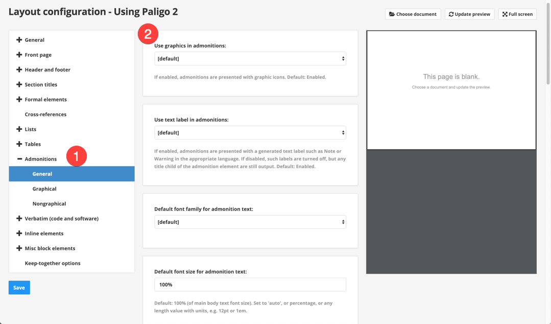
    change-admonitions-pdf.png
  4. Select Save.